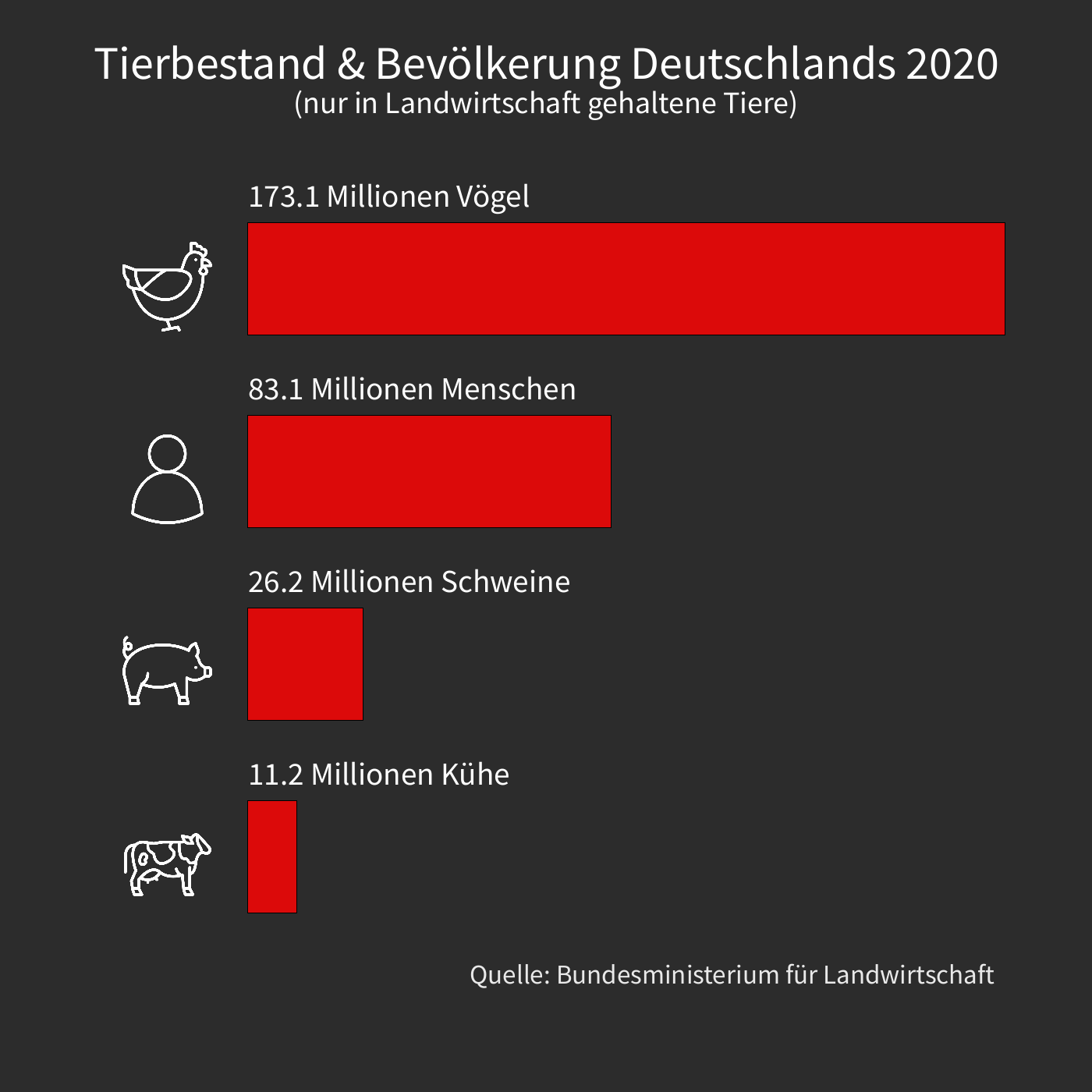
Ich habe mich erneut damit beschäftigt, Daten visuell darzustellen. Dieses Mal habe ich jedoch nicht R, sondern Processing verwendet. Auch wenn es dafür nicht ideal ist, gibt es mir mehr Kontrolle und erleichtert das Animieren. Glücklicherweise musste ich in diesem Fall keine großen Datenmengen verarbeiten, was die Aufgabe relativ einfach machte.
Als Inspiration diente mir ein Artikel von Animal Equality. Die darin enthaltenen Daten fand ich sowohl faszinierend als auch besorgniserregend. Ich dachte mir, dass man daraus etwas machen könnte und das Ergebnis könnt ihr oben sehen.
Durch die Größe der Zahlen ist es leicht, einzelne Lebewesen zu ignorieren. Daher habe ich eine Animation erstellt, um besser zu veranschaulichen, wie oft Tiere getötet werden.
Das war mir aber immer noch nicht genug deutlich genug und ich hatte eine wilde Idee: Ich könnte das ganze in Minecraft simulieren und die jeweiligen Spiel-Tiere im gleichen Takt sterben lassen, wie die echten Tiere. Nach einigem herumprobieren gelang es dann auch.
Das dazu gehörende Video wurde auf r/dataisbeautiful war ziemlich erfolgreich und fand viel Zuspruch.
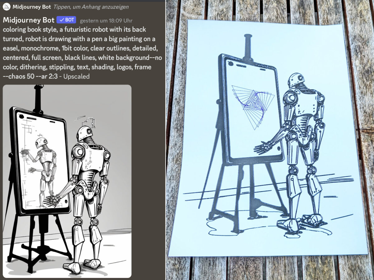
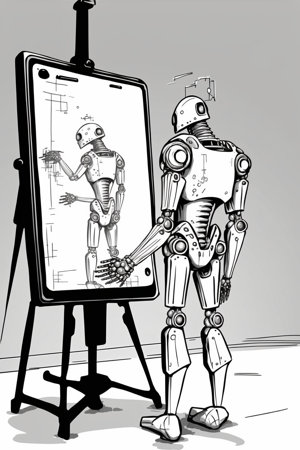
on the left we see a AI generated image on the right we see a pen plot of the same image.
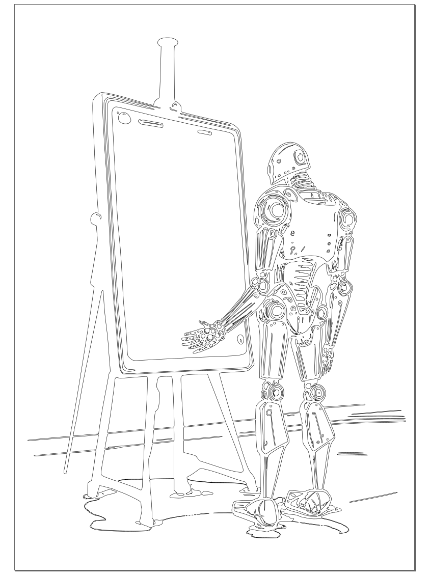
Do you love AI-Art? Do you love Penplotting? You just don’t know how to combine them using the strengths of both tools?! Well, have no fear because I am here to show you a technique that will bring your AI-generated art to the physical world with the help of a pen plotter.
The key to this technique is using AI to generate images in a coloring book style, which is useful, when you use a printer that just draws lines.
To follow this guide, you’ll need:
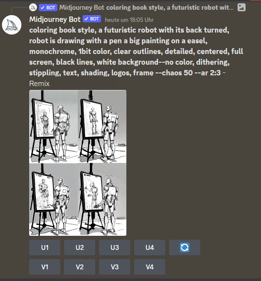
Access to an AI which can generate images. Midjourney, Stable Diffusion or Dalle will work. (I personally prefer Midjourney because it gives the best and most visually pleasing results, but you do you)
Photo Editing software, such as Gimp or Photoshop (because let’s face it, no AI is perfect – yet)
Inkscape with the Axidraw Extension (because, plotter)
There is no coding needed for this technique.
Generate image with AI
Useful terms (midjourney):
coloring book style, <description>, monochrome, 1bit color, clear outlines, detailed, centred, full screen, high contrast, black lines, white background
Ideally, you want an image which is just black and white, with no grey color in between (1bit).
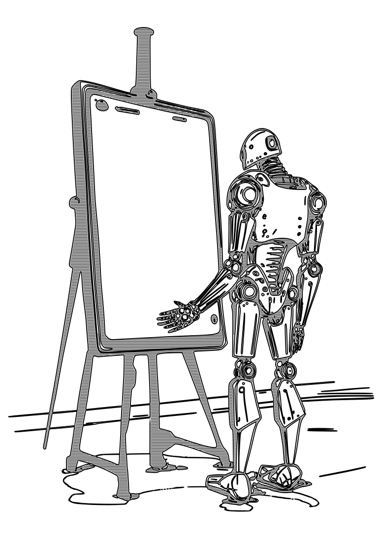
Fix the image, raise contrast
The next step in our process is editing the image. It can be a bit of a pain, but trust me, it’s worth it in the end. The goal here is to clean up any mistakes the AI made and crank up the contrast, so we’re left with a sleek black and white image.
Now, when it comes to increasing contrast, just cranking up that contrast slider isn’t going to cut it. You’ll lose some of the finer details that way. My personal go-to method is a combination of working with the contrast curve, sharpening tools, and a bit of manual repainting. Some manual tweaking is necessary, lines disappear due to being too light or thin.
In this example, I made a few notable changes, like:
Removing the content within the frame
Attempting to recreate the easel without altering the geometry
Removing some fingers on the hand
Removing AI-generated artefacts.
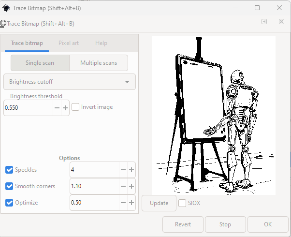
Convert image to a vector file
As a next step, open the fixed image in Inkscape.
Make sure you have the image selected in the objects menu and then select “Path” –> “Trace Bitmap”.
A window should open like in the image above (first without a preview). For me, “Single scan” –> “Brightness cutoff” worked best so far, but feel free to experiment. Same of the options values at the bottom. Click “Update”
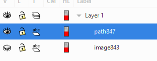
When you are happy with the result, click “OK”. In the next step, deactivate the image object by clicking on the eye and select the newly created path.
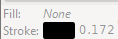
In the bottom left corner of the Inkscape window, change the fill-color to “none” and stroke-color to some visible color.
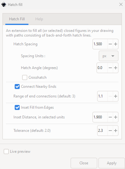
Hatch the empty spaces
To fill the empty spaces, select Extensions –> Axi Draw Utilities –> Hatch Fill. Settings depend on size of paper and pen used.
I used these settings for A4 with 0.8 pen, which worked quite well. But I would make the inset distance a bit smaller, there were sometimes gaps between the outline and the hatching.
Plot it
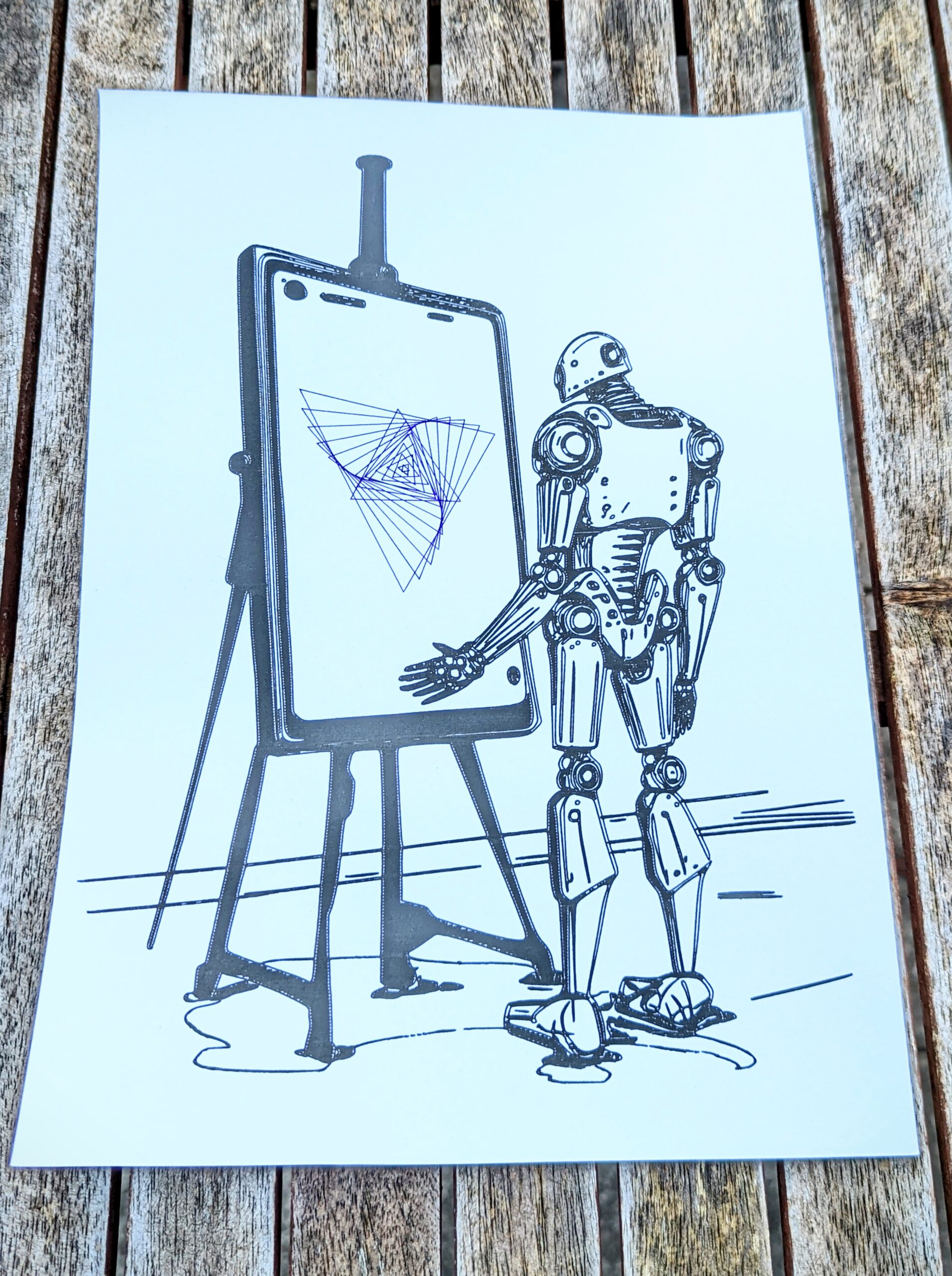
And that’s about it! The only thing left to do is to plot your masterpiece (beautiful, award-winning, by Greg Rutkowski).
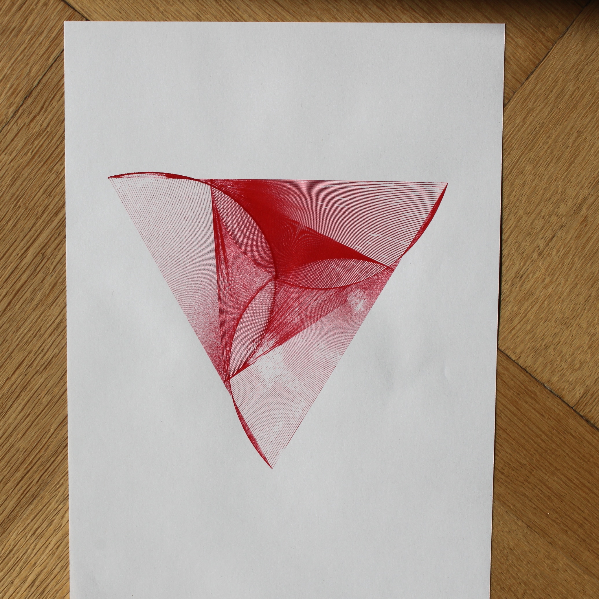
As a little bonus, I added generative art on mine.
This is just the basic technique, there’s a whole world of possibilities out there to improve and build upon it. I’ve been experimenting with taking apart the images and working with different layers and colors. If you want to see some of my experiments, check out my Instagram.
Also, I wrote a tool for myself that does the vectorizing. The advantage is the hatching follows the structure of the outlines, which leads to nice results compared to just parallel hatching.
So, thanks for reading and if you want to give me some feedback, hit me up on Instagram or Mastodon.
Pen plotting is a fantastic way to create unique artworks and designs. There are a lot of things to find out and get the hang of, this guide should help. I am using an Axidraw pen plotter, but most advice should be useful for other plotters too.
This was originally planned as a handout after a workshop for pen plotting I wanted to give. It didn’t happen, so maybe other people can learn from it.
People who just got a pen plotter and started to play around, will probably find this most useful.
Checklist before starting a plot
Open and check SVG file:
Is the correct format set (e.g. A4, landscape)?
Are the correct colors enabled/disabled?
Check settings (speed, pen height,etc.)
Check work area:
Is the correct pen inserted and secured?
Is the paper flat and nothing hidden under it?
Is the paper well fixed?
Is there nothing in the way of the plotter arm?
Start printing. Ideally, wait until the first lines are drawn to make sure you didn’t miss something.
Things to know when working with a pen-plotter (AxiDraw)
The servo motor lifts and lowers the pen, but it does not press onto the paper (use a weight when more pressure is needed)
The pen-plotter draws lines, it can’t fill areas like the bucket in paint (use hatching instead).
A running plot can only be interrupted with the button on the plotter. You can continue in Inkscape under “Axi Draw Control” → Resume.
It is worth making a small test print before starting a 8h plot when trying something new.
Servos wear out, it is worth having a reserve, especially when you do plots that take a long time (there is now a new version, which is quieter and lives longer)
Possible problems when plotting
Paper is not properly aligned with Plotter. (Draw lines on the surface under the Plotter for orientation)
Plotter / Paper / Surface is moving due to the movement of the pen-plotter.
Paper roughens up / gets holes from many pen strokes (use stronger paper, different pen, optimize file to reduce repeating lines)
When using multiple pens, pay attention to pen diameters (the tips might not have the same position, which might lead to misalignment)
Computer goes into sleep mode during print (change the settings on your computer to a longer time)
Surface not evenly flat → strokes don’t have the same thickness / darkness
Certain pens may need additional weight to draw evenly
Different colors can bleed into each other, depending on pen, color sequence matters
Here I used different kinds of pen, which lead to them not properly aligning. Also, I draw the black grid first, which then mixed into the lighter areas.
Pen Selection
Pens with hard tips work best, as they don’t wear down and move evenly.
Fiber tips (such as Stabilos) wear down depending on the surface.
Certain pens will fade over time. (to avoid use pen that are sun proof )
With certain pens, the plot speed makes a difference to the result (slow movement, more ink can flow from the pen)
For initial CYMK plots (Cyan, Yellow, Magenta), Stabilos are practical for learning and easily available
Lead and color pencils are very difficult to use as they require more pressure and wear down fast
Two passes when printing can lead to better results (for example, with less reliable pens)
While this is one of my favourites, it’s also an example of a bad pen. The pen did draw quite unreliable. This was lucky in this case, because it gave the whole image texture and a depth it just wouldn’t have otherwise.
Paper selection
Generally, all paper works. Cheap paper sometimes looks cheap.
Cheap paper tends to tear more easily with multiple passes trough one point.
Flatter paper is more reliable with all pens (like printer paper)
More expensive paper has a nicer texture, but tends to wear out certain pens more quickly.
It doesn’t need to be paper, experiment around, why not try glass, wood or something else (but maybe test first on paper)
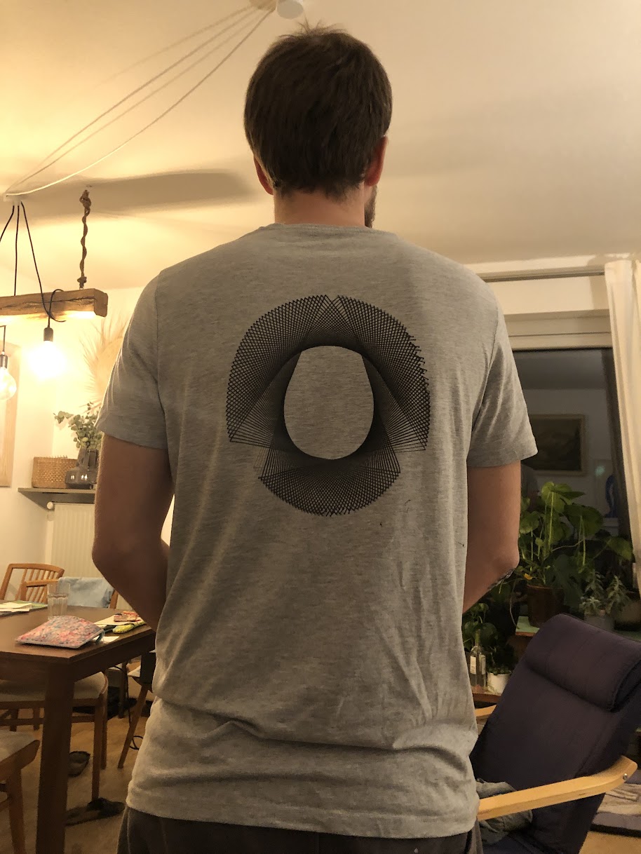
Printing on fabric is possible, but not easy; it is important to keep the fabric taut for even printing. Detail is limited.
Plot on a Shirt. Original SVG was in a proper circle, it is difficult to put tension on the shirt equally. Choose flexible, log details designs.
How to work with Inkscape (AxiDraw)
Through the AxiDraw plugin, the Inkscape becomes an interface for controlling the pen plotter. To start printing in the menu: Extension → Axidraw Control → Apply.
Only the lines and groups that are currently visible will be printed (important for using different pens).
Optimizing line order leads to faster prints (then pen moves to a close line): Axidraw Utilities → Plot Optimization. Can be activated by default.
Axidraw plugin functions for Inkscape
Hershey Text. Better letters for plots. If you use normal fonts, it just draws the outline of the letters (which sometimes works well enough). With Hershey-text, letters are drawn with only one line (not the outline of the letters).
Hatching: Plot can only draw lines, not surfaces, but with hatching, you can fill surfaces with lines.
Plot Duration Estimation: Axidraw Control → Options → Preview → Enable offline Preview mode → Start normal printing
Axidraw + Processing – This tutorial is addressed to people who have basic knowledge of the Processing environment and who are familiar with structures like variables, functions and loops.
Awesome plotters – A curated list of code and resources for computer-controlled drawing machines and other visual art robots.
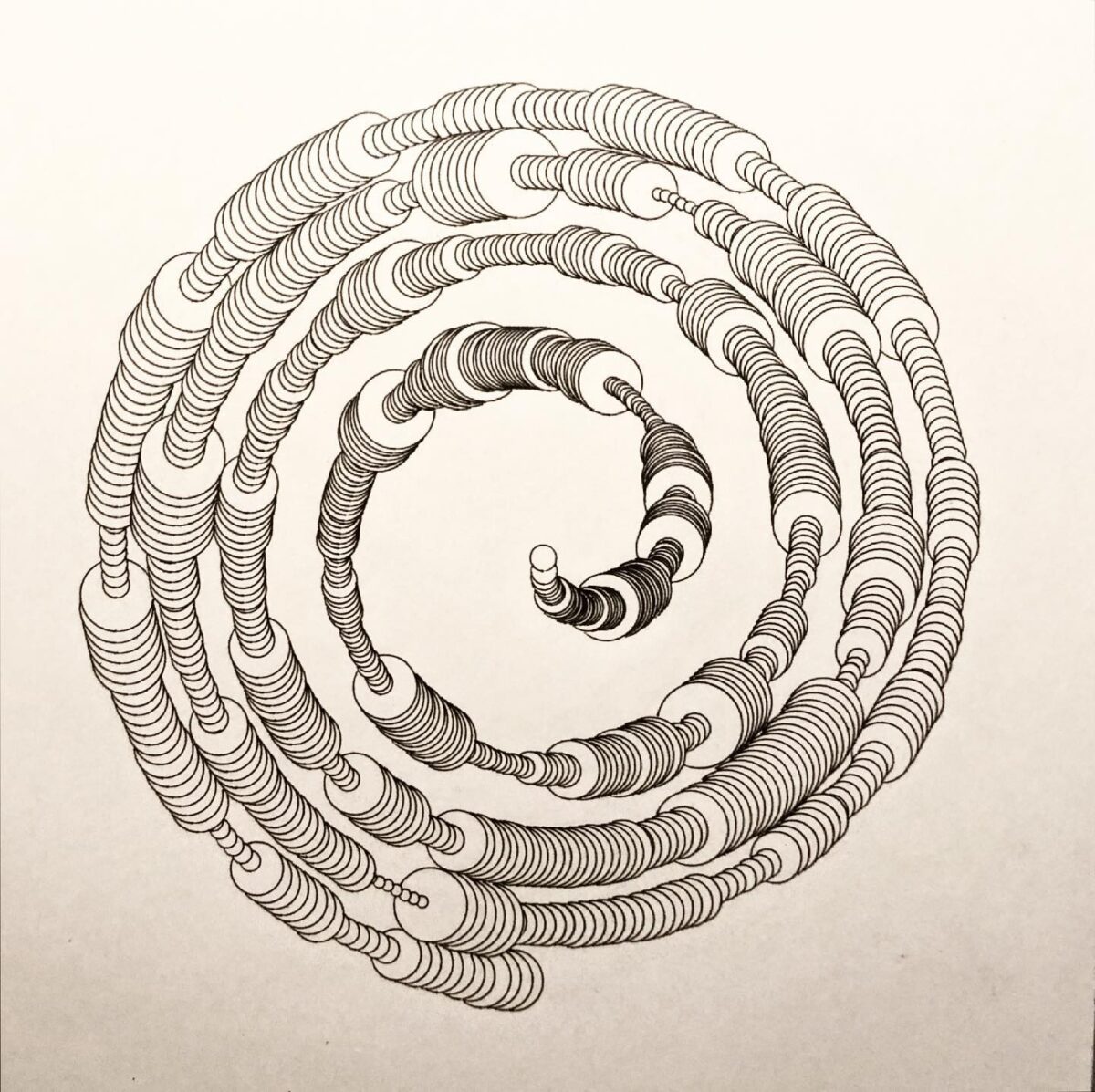
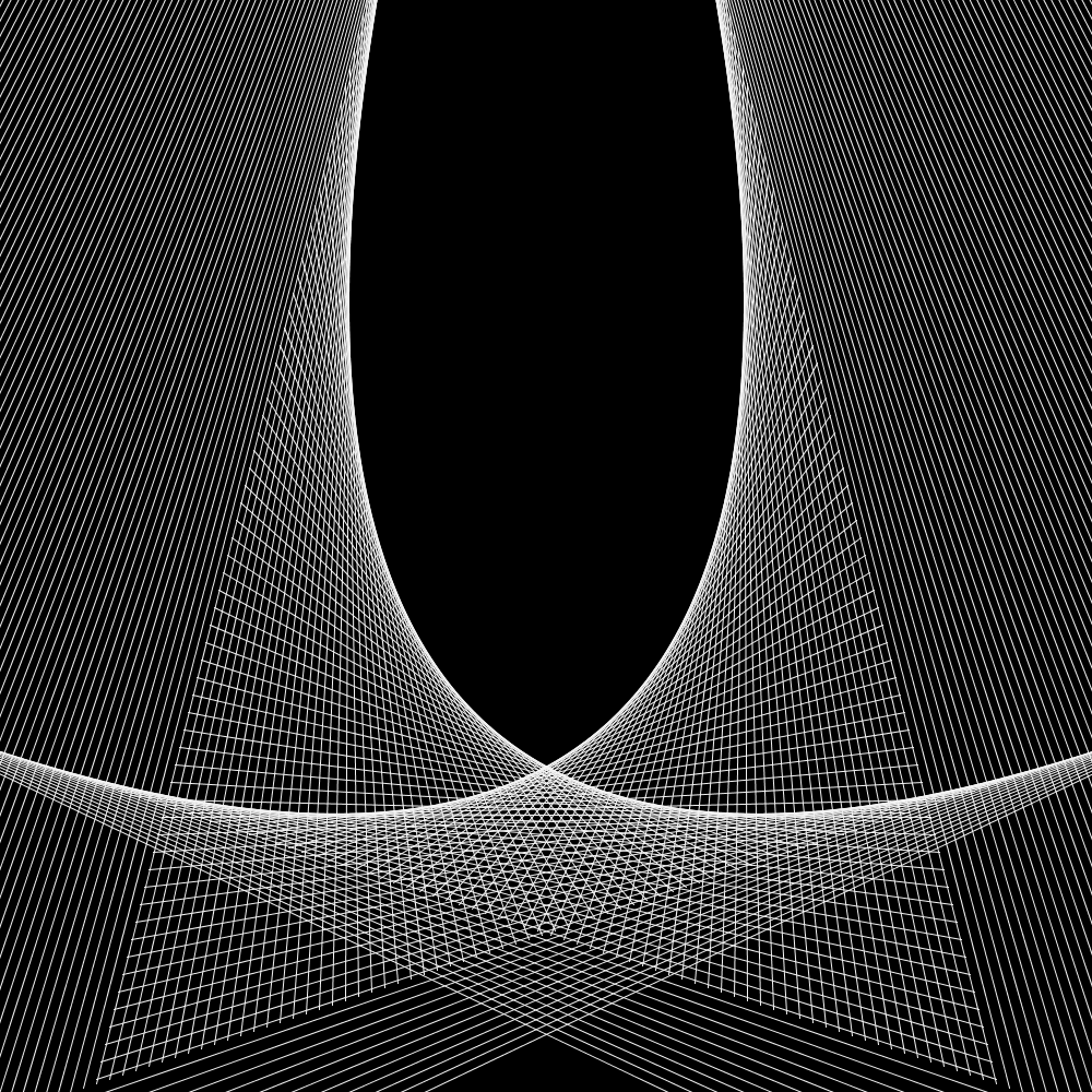
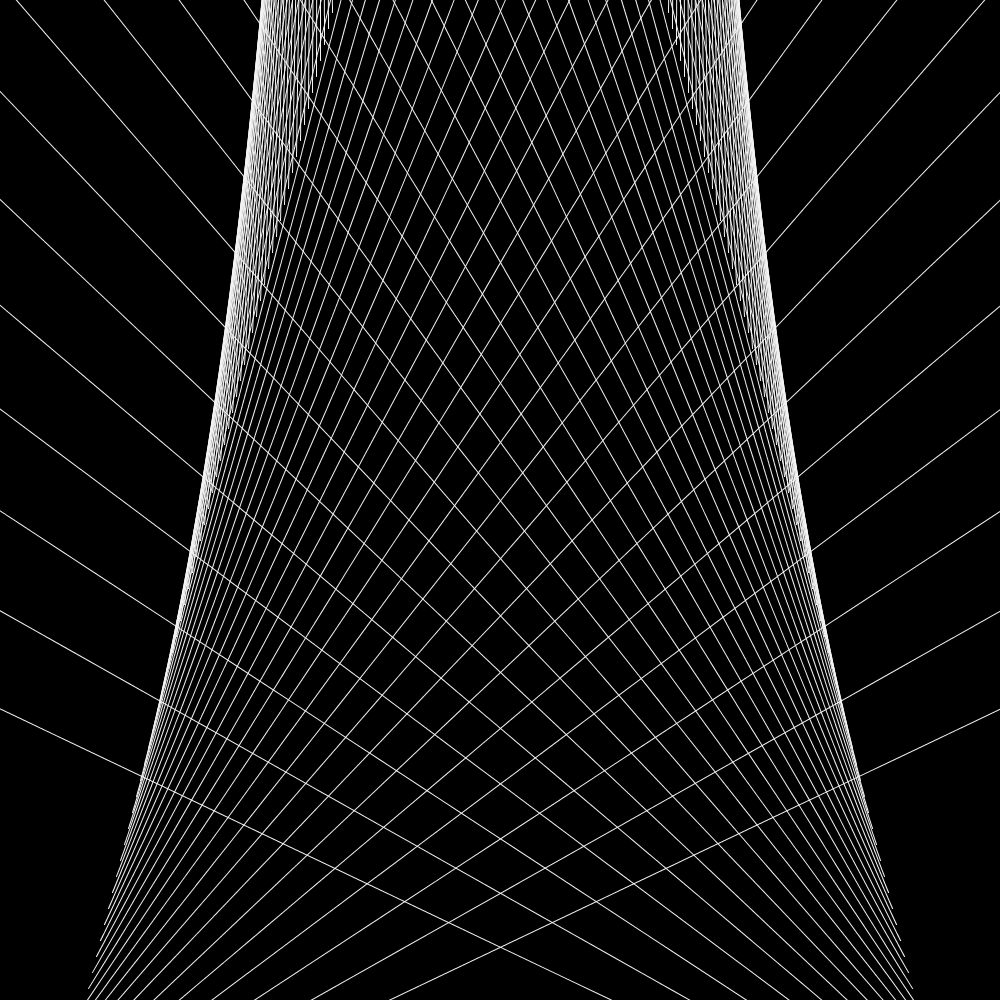
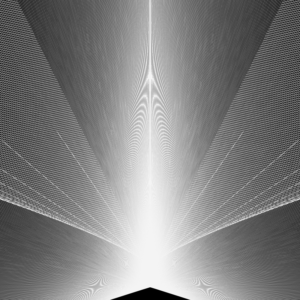
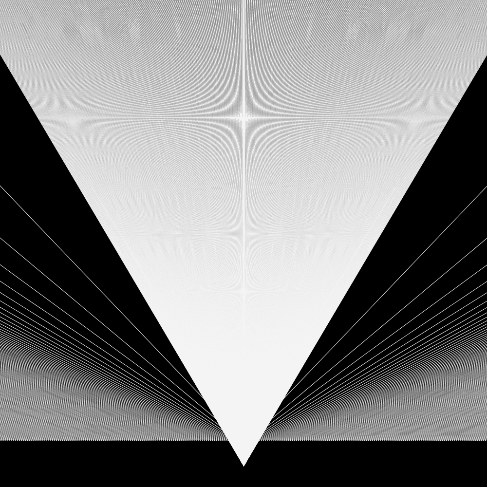
This is an introduction into coding with the goal of creating generative art. There will be no actual coding in this post, just fake code based on Processing. All you need to know is some maths from school.
A lot of generative art is at its core a combination of lines and filled out shapes created by a computer. Still, it is hard to explain it to someone with no experience in programming. This introduction is my attempt at explaining how I tell the computer to draw cool images.
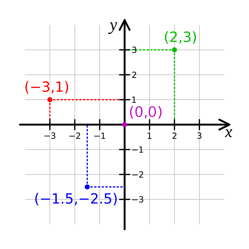
Every Screen is a coordinate System
You remember the coordinate system from school? It is at the core of everything when we try to draw on screens. It’s very useful.
(Wikipedia: Coordinate System)
You can use the coordinates to tell the computer where to draw stuff, like for example points -> Point(x,y)
Point(2,3)
Point(-3,1)
Point(-1.5,-2.5)
(This code isn’t a real programming language, but most would work similar like the example. First the name of a function, like “point” and then the coordinates in brackets)
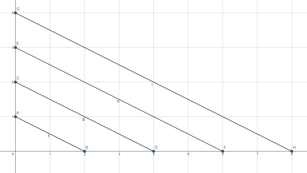
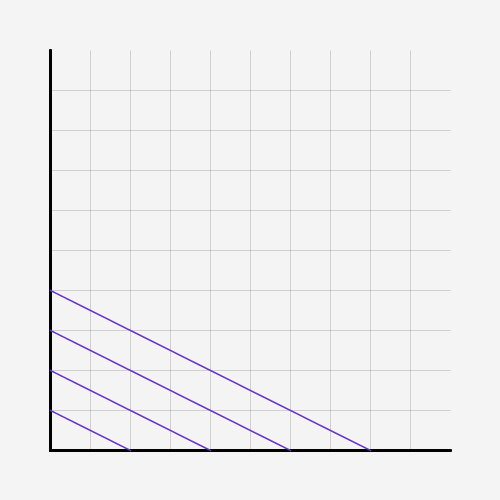
With the same principle, you can tell the computer to draw lines:
Line( start_x, start_y, end_x, end_y)
That translates to: Draw a line from Point (start_x, start_y) to Point (end_x, end_y).
Writing down coordinates isn’t taking advantage of a computer and annoying. Computers are great in adding and repeating things many times, so they should do the work.
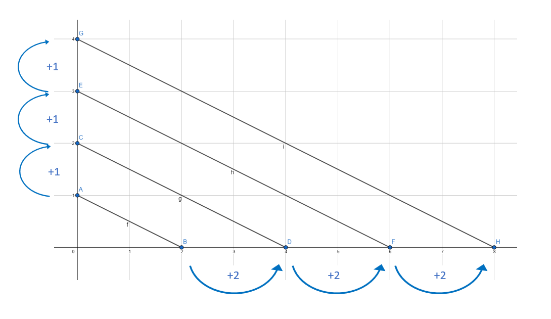
There is a pattern in the distance of the lines. This is easy to automate with a computer. But first, you need to understand two concepts in programming: Variables and Loops.
Variables
Variables are a way for the computer to remember numbers (also text and lists, but that is not relevant here). We need them to reuse values. One basic thing we need them for is to count. And to count up you need to remember the last number you counted. Same for the computer.
Variables work similar like letters in maths. You assign a letter (or a word) a value. That letter is then equal to that value.
a=3
banana=1
c=a+banana
a is set to 3 banana is set to 1 c is set to a+banana
c is now 4.
Now we learnt this, we can use that to create our first line.
We want to draw more than one line and that is why we need loops.
A loop works this way: You tell the computer to repeat a piece of code (all the text inside the curly-brackets) until a certain condition is met. To use a loop the command “while” is used in many programming languages.
counter=1
while (counter<=4){
   counter = counter+1
}
Here we create the variable counter. The variable “counter” is set to 4. While the variable “counter” is smaller or equal to 4, repeat code in brackets{ “counter” is set to “counter” +1. }
We create a variable counter and count with it to four. Afterwards, the condition in the loop is met and the loop ends.
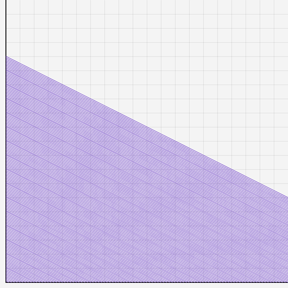
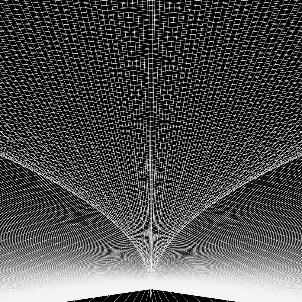
And now we bring all what we have learnt together. We use the variables and the loop to create the graph we drew earlier.
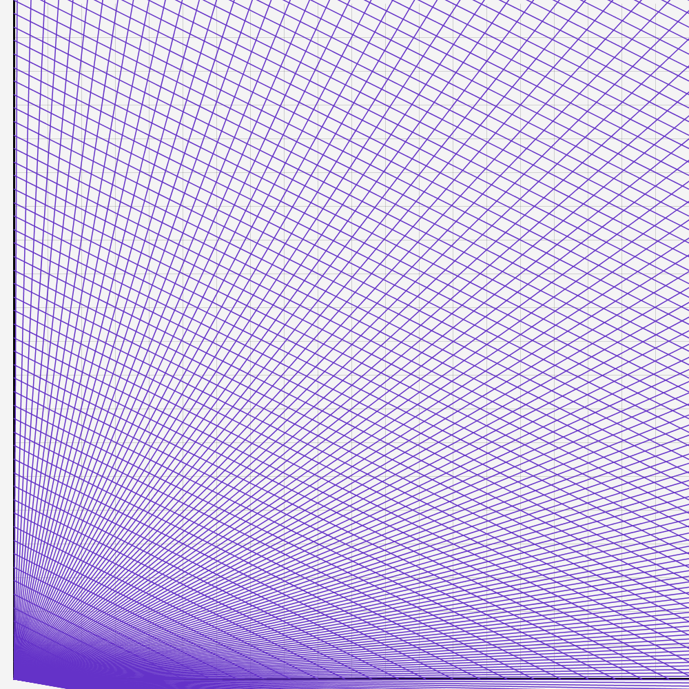
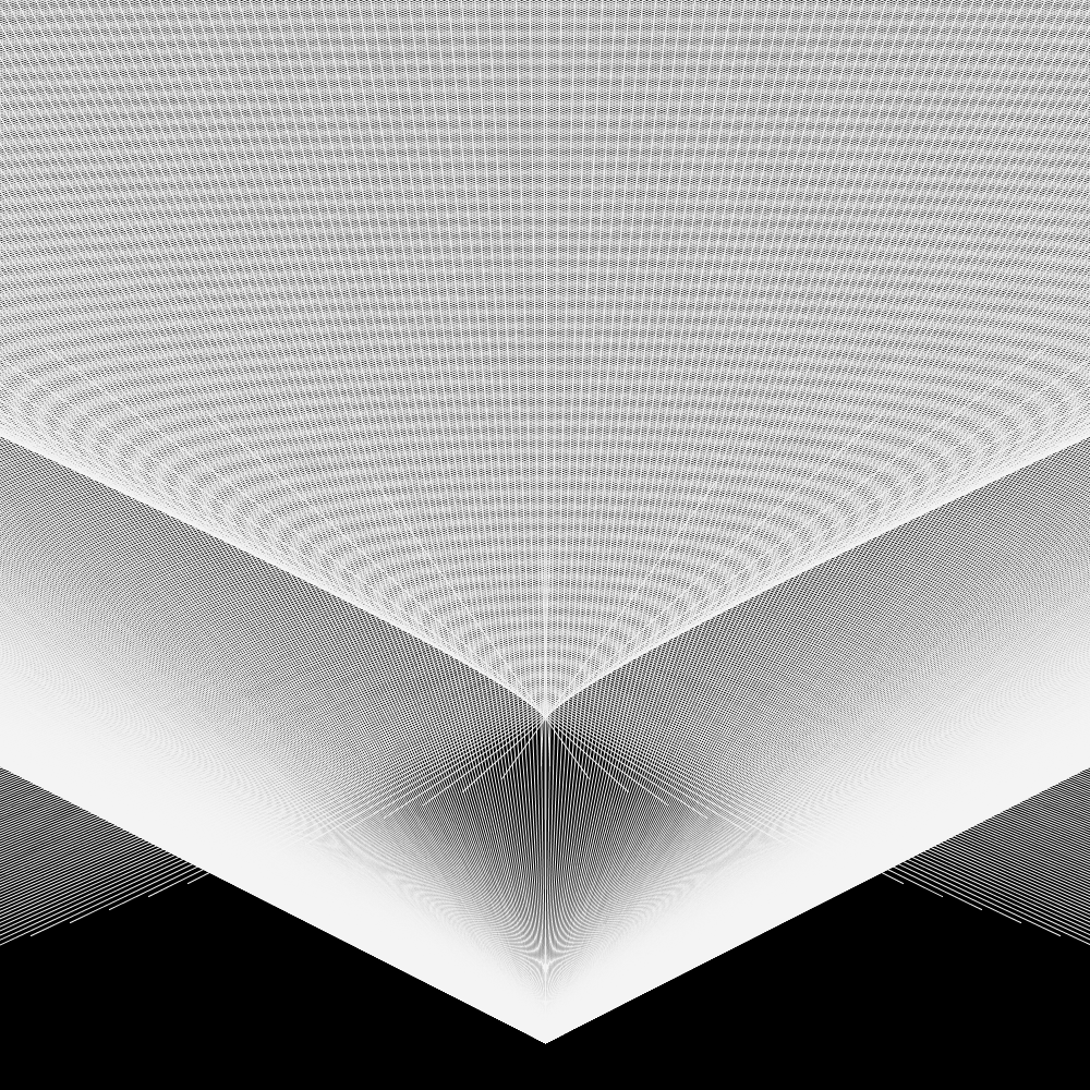
Now we have a foundation to create generative art. After playing around with the values and adding 1 or 3 more lines each loop, I have created some interesting results. If you would add a nice looking frame, you could call it art.
(The quality suffered from compression)
I hope you learnt something. For feedback or if you want a second part with real code, let me know on Instagram or Twitter
I am back, nearly two years later. I haven’t posted anything here, but I wasn’t idle, I really got into Generative Art and shared it on Instagram. I posted over 200 Images in the last two years, all based on my code!
When you look at my last three posts, you see that I started to dabble in Generative / Glitch art. I was using R, because I was most familiar with the tool. I realized soon, that it might not be the ideal tool. I started looking into Processing.
Processing is a programming language based on Java. It was designed as an intro to programming with a strong visual emphasis. It is quite popular in the Generative Art space, which is why I made the leap. After some struggle at the beginning, it proved to be quite easy to learn. There are a lot of good tutorials
But that wasn’t all: I learnt about Pen Plotters, machines that do the drawing for you and are quite popular with generative artists. Basically, it is a machine that can draw with a pen and can draw vector graphics.
I was fascinated and bought one for myself. I am now an owner of an Axidraw A3 by Evil Mad Scientists. I started plotting and I still am today. After doing this for two years, I thought it might be time to write up some things I learnt.
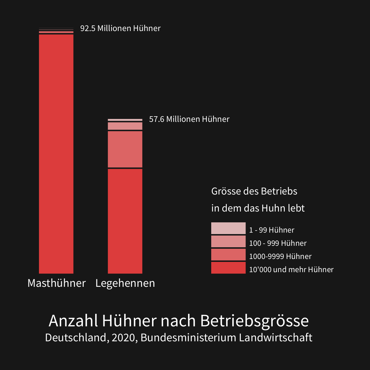
Und hier noch eine Grafik, welche es nicht in den Abschluss-Post geschafft hat, deshalb auch nicht so toll aussieht:
Zum Abschluss noch ein Bild, welches ich ebenfalls für Tauchstation gemacht habe, allerdings für eine Story. Es zeigt, wie die 0-Grad-Grenze, also die Höhe, wo die Wintertemperatur im Schnitt 0-Grad ist, immer weiter den Berg hochwandert. Es handelt sich um einen Schweizer Schnitt und nicht um die Temperatur am Berg genau.
I tried making a shiny app about 2 years ago, but I never really got it online for some reason. But after talking to a friend I tried again and it was surprisingly easy! Maybe I just got a lot better using R or the server infrastructure got a lot easier to use.
I still could improve a few things UI-vice and maybe add more options. But honestly for a prove of concept it is good enough and I am quite happy how well it works. And I really like the results.
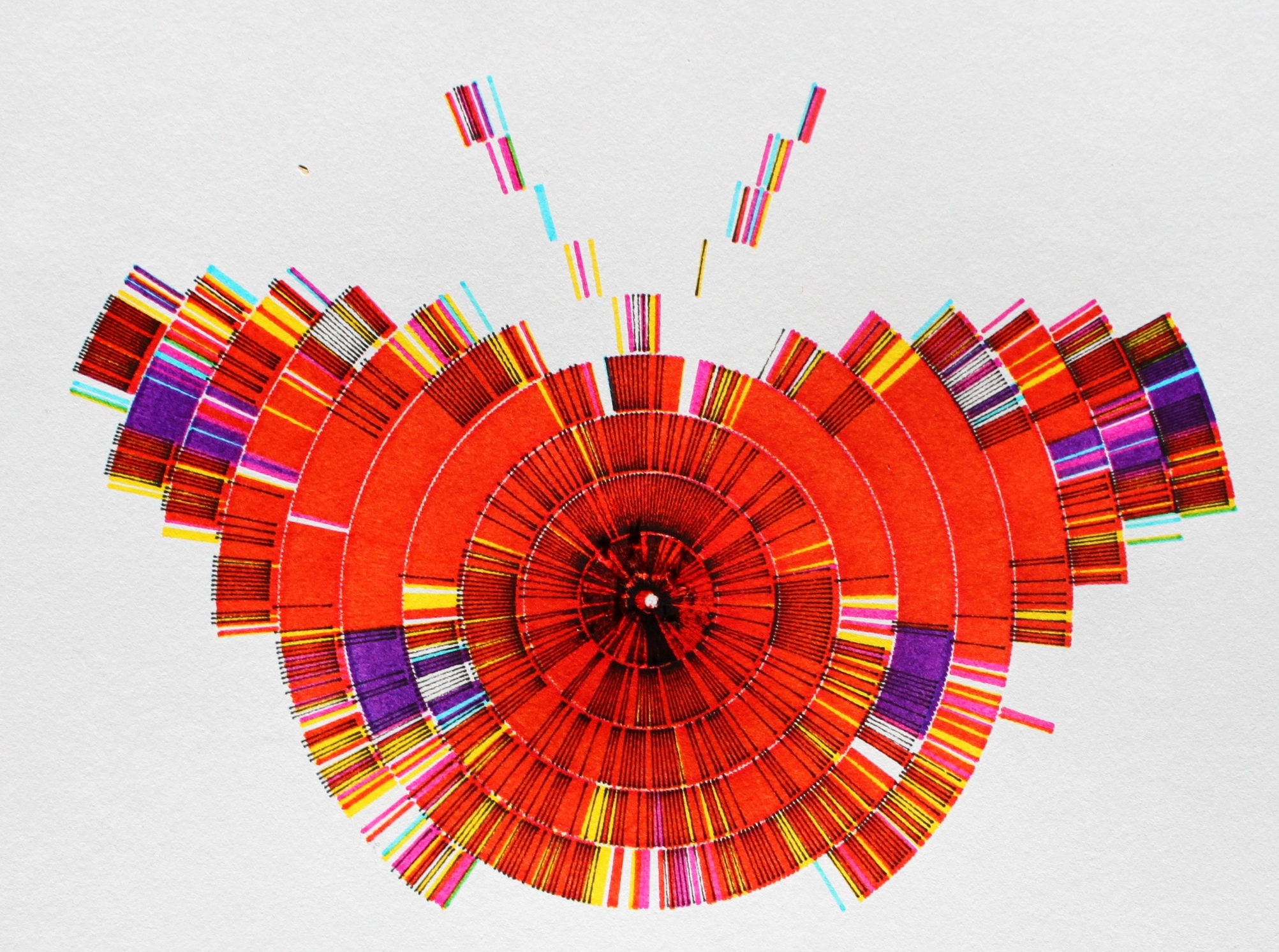
I listen to podcasts all the time. But I didn’t really have a clue how much time I spend on it and what kind of podcasts I am even listening. So I started to track my habits. To do so I switched my podcast-app to Podcast-Addict. The app tracks how much time you spent on each podcast. Unfortunately there is no way to properly export that data, so I had to type in the times manually once a month. I did that for one and a half year of which I used one year. (My phone broke so there was a 10 days gap and I thought one year is prettier anyway.)
The main problem was that the interesting information was which podcast I listen to and how much. But at the same time there were 75 of them, too many to give space to all of them, because it would look to crowded. I tried anyway and the result is the graph “Podcasts by Category”. And it definitely is too crowded, but I am still quite happy with it because it manages to show a lot of information at once without being too confusing.
An alternative was to summarize the Podcast into categories, but this would be mainly interesting for myself but for no one else, also because the categorization is a bit arbitrary at times. For me, the result was interesting: I could clearly recognize the time I was working, the time I started my master thesis and the time in between. In the month with the huge spike I went back to university but most of my friends weren’t back yet. I was also listening to the Versailles Anniversary Project (100 years), which followed the making of the Versailles treaties nearly day by day and because I started a month to late I had a lot of catch up to do (amazing work by the way. Check it out)
One goal of this visualization was to try to properly apply one theme to all the graphs, so they look like they belong together. I think that worked quite well beside some minor errors. I also tried to get better at using colours. I wasn’t to successful there, the colours I used in the end for the languages are quite ugly and I should have played around with it a little longer.
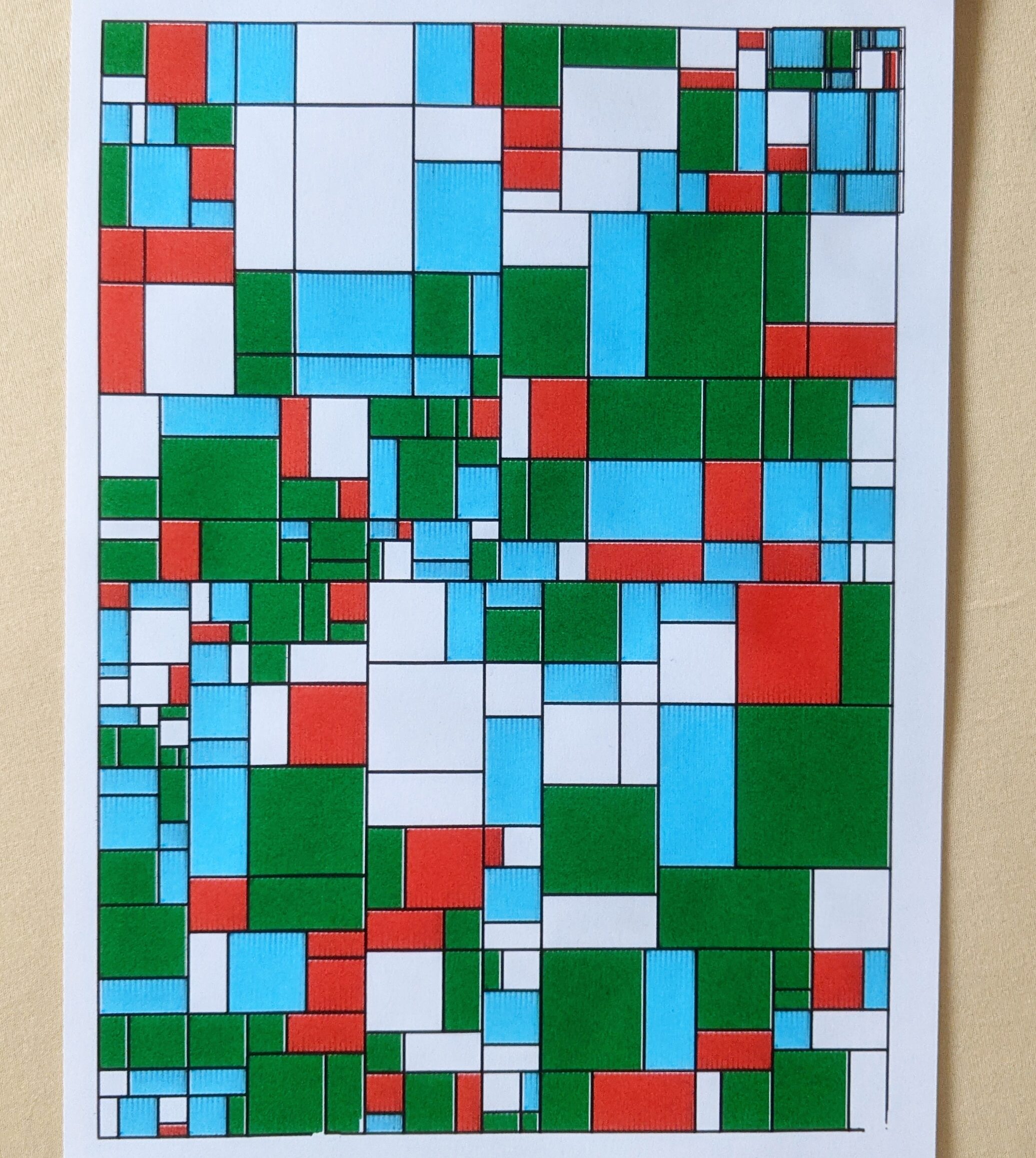
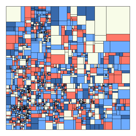
Motivated by my last experiments with Glitch Art I decided to look a bit more into generating images with R. One of my favorite musicians Max Cooper released another absolutely gorgeous music video. Check it out, the animation is fantastic. I was intrigued by the simple basic structure. It was just a rectangle divided by rectangles divided by rectangles. Something I can absolutely do with my R skills. So, I tried. The pictures are a result of that.
My tactic was to create a data frame just starting with the first rectangle, defined by start and end coordinates then just splitting them. I filled them randomly with colors. Honestly quite simple. Doing this and other experiments, I got a lot better making code run faster in R. Of course there is still a lot of space to improve. The code in my last post for example was super inefficient and I made a lot of basic mistakes (I improved it and now it runs a lot faster).
Here is the code if anyone is interested:
library(tidyverse)

rectanglesplitter=function(data,i){
#data is one line of the total dataset, i is the number of the loop.
#because I don't want super long rectangles, I always first check which is the longe side.
yaxsplit=ifelse((data$z.x-data$a.x)^2>=(data$z.y-data$a.y)^2,F,T )
#create the divider which is a value which defines the proportions of the two new rectangles
divider=1/(random[i]+1)

#rectangle 1
########
#ifelse is necessary to change if it is a vertical split or not.
#here the new x.a1 and new y.a1 is created. (naming was a bit stupid I admit)
data[2,1]=ifelse(yaxsplit==T, data[1,1] , data[1,1]+(data[1,3]-data[1,1])*divider)
data[2,2]=ifelse(yaxsplit==T, data[1,2]+(data[1,4]-data[1,2])*divider, data[1,2])

#Points stay stay the same no mater the orientation.
#x.z1 and y.z1 are created
data[2,3]=data[1,3]
data[2,4]=data[1,4]

#rectangle 2
#are the same like in the first created recangle (x.a and y.a)
data[3,1]= data[2,1]
data[3,2]= data[2,2]
#y.z2 and y.z2
data[3,3]=ifelse(yaxsplit==T, data[1,3] , data[1,1] )
data[3,4]=ifelse(yaxsplit==T, data[1,2] , data[1,4])


#add level (for potential animations)
data[2,5]=i
data[3,5]=i
#add a color. one of the rectangles keeps the color of the bigger rectangle, not necessary
data[2,6]=random[i]
data[3,6]=data[1,6]

#this changes which one of the rectangles is saved first. this should change it up and make sure there aren't more splits on one side.
if(random[i]%%2==0){
data[3:2,]
}
else{data[2:3,]}
}

# a list of color palettes
pallist=list(
palette=c("black","#CDCFE2","#423E6E","#FF352E"),
palette=c("#233142","#455d7a","#f95959","#e3e3e3",NA)
)

#how many splits should be done?
loops=50000
#create empty dataframe
df=data.frame(a.x=rep(NA,loops*2),
a.y=NA,
z.x=NA,
z.y=NA,
level=NA,
color=NA,
alpha=NA)
#fill first row
df[1,]=c(0,0,100,100,1,1,1)


#precreate random vector used for proportions and colors.
random=sample(1:4,loops,replace = T)

i=1
while(i <loops){
#filling up dateframe with simple loop and splitter functions
df[((2*i):((2*i)+1)),]=rectanglesplitter(df[i,],i)

#this skips every few rows, so there stay a few bigger rectangles.
i=ifelse(i%%17==0&i>881,i+2,i+1)
}


#this is just for me to choose one palettes in the list
farbe=1
ggplot(df)+
geom_rect(aes(xmin=a.x,ymin=a.y,xmax=z.x,ymax=z.y),
alpha=9,show.legend = F,fill=pallist[[farbe]][df$color],col=pallist[[farbe]][5])+
coord_fixed()+
theme_void()