Categories
Chart Europe R Switzerland

Veränderung der Durchschnittstemperatur in der Schweiz (1900 – 2020)

Hier noch eine Version ohne Animation:

Und hier noch eine Grafik, welche es nicht in den Abschluss-Post geschafft hat, deshalb auch nicht so toll aussieht:

Zum Abschluss noch ein Bild, welches ich ebenfalls für Tauchstation gemacht habe, allerdings für eine Story. Es zeigt, wie die 0-Grad-Grenze, also die Höhe, wo die Wintertemperatur im Schnitt 0-Grad ist, immer weiter den Berg hochwandert. Es handelt sich um einen Schweizer Schnitt und nicht um die Temperatur am Berg genau.

Categories
Chart R

I tracked my Podcast-listening for one year

I listen to podcasts all the time. But I didn’t really have a clue how much time I spend on it and what kind of podcasts I am even listening. So I started to track my habits. To do so I switched my podcast-app to Podcast-Addict. The app tracks how much time you spent on each podcast. Unfortunately there is no way to properly export that data, so I had to type in the times manually once a month. I did that for one and a half year of which I used one year. (My phone broke so there was a 10 days gap and I thought one year is prettier anyway.)

The main problem was that the interesting information was which podcast I listen to and how much. But at the same time there were 75 of them, too many to give space to all of them, because it would look to crowded. I tried anyway and the result is the graph “Podcasts by Category”. And it definitely is too crowded, but I am still quite happy with it because it manages to show a lot of information at once without being too confusing.

An alternative was to summarize the Podcast into categories, but this would be mainly interesting for myself but for no one else, also because the categorization is a bit arbitrary at times. For me, the result was interesting: I could clearly recognize the time I was working, the time I started my master thesis and the time in between. In the month with the huge spike I went back to university but most of my friends weren’t back yet. I was also listening to the Versailles Anniversary Project (100 years), which followed the making of the Versailles treaties nearly day by day and because I started a month to late I had a lot of catch up to do (amazing work by the way. Check it out)

One goal of this visualization was to try to properly apply one theme to all the graphs, so they look like they belong together. I think that worked quite well beside some minor errors. I also tried to get better at using colours. I wasn’t to successful there, the colours I used in the end  for the languages are quite ugly and I should have played around with it a little longer.

Categories
Chart Europe History

The Reign of Roman Emperors

I visualized the reign and end of Roman emperors. I am quite a fan of history, so when the task in the /r/dataisbeautiful-DataViz-Battle was to visualize the reigns of the Roman Empire, I was excited.

Categories
Chart Europe Population

To which European countries do Europeans migrate?


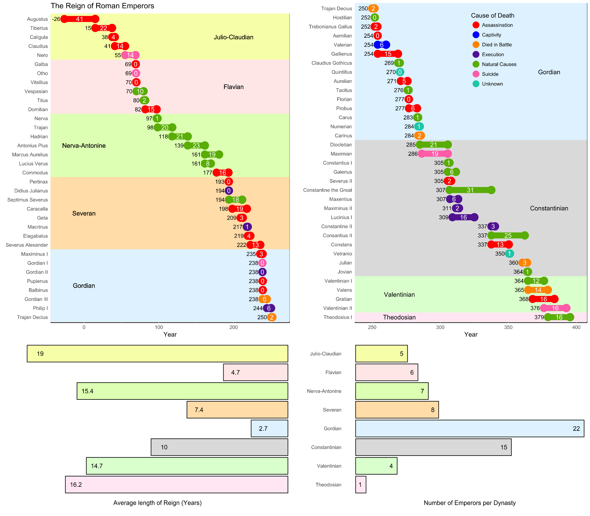
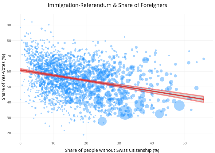
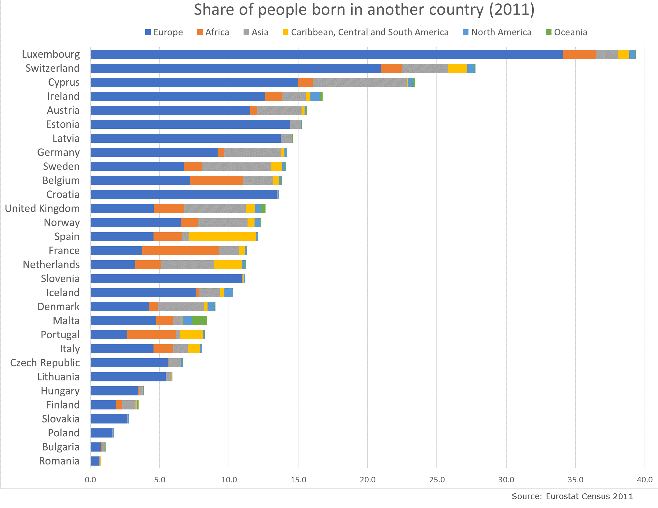
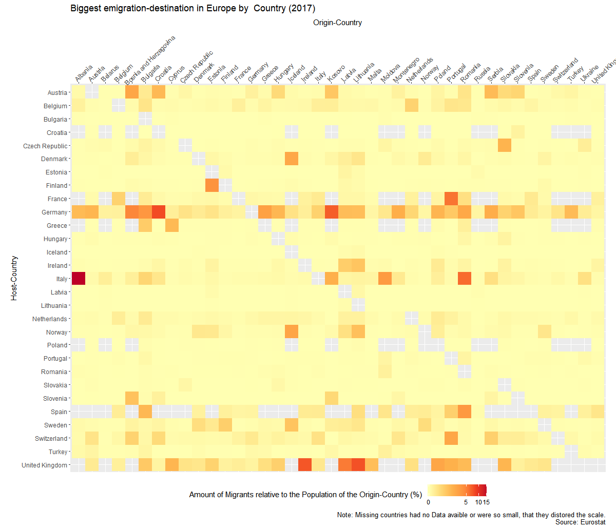
Migration is a huge topic in Europe and I wanted to know where people go, when they leave the country they grew up in. Luckily Eurostat has some Data about that.

There is the problem of huge population differences between the countries, so I wasn’t able to just use the absolut numbers. So I created to graphs. Once it show the migrant-population  relative to the host country and once relative to their origin country.


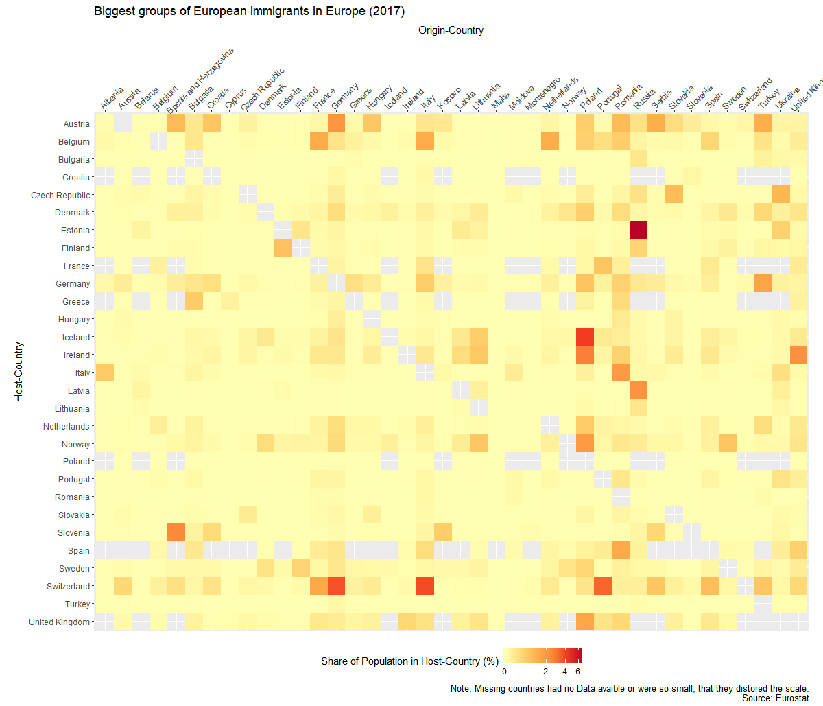
I created the graphs with the help of R and Ggplot. Code of the second graph:

ggplot(mig1,aes(y=Host,x=Origin,fill=sharehostpop))+
 geom_raster()+
 theme_gray()+
 coord_equal()+
 scale_fill_distiller(palette="YlOrRd", direction = 1,na.value=NA,trans='log1p')+
 theme( 
 axis.text.x=element_text(angle = 45, hjust=.1),
 legend.position = "bottom")+
scale_x_discrete(position="top")+
 scale_y_discrete(limits=names(table(droplevels(mig1$Host)))[length(names(table(droplevels(mig1$Host)))):1])+
 labs(y="Host-Country",x="Origin-Country",fill="Share of Population in Host-Country (%)",
 title="Biggest groups of European immigrants in Europe (2017)",caption="Note: Missing countries had no Data avaible or were so small, that they distored the scale.
 Source: Eurostat")
Categories
Chart Politics Population Switzerland

Voter turnout in Switzerland compared to population

Categories
Chart Germany Switzerland

How many pigs live in Switzerland, Austria and Germany?

31’642’218 pigs lived in Austria, Switzerland and Germany combined, if we trust the numbers of the statistical ministries. I recently saw that governments release the numbers of farm-animals in a country.

Categories
Chart Europe Population

Growth of European Countries relative to 1950


How did the populations of European countries grow after the end of the 2nd world-war? To answer this question I downloaded population-data from the United Nations. I picked 1950 as my default year and looked how it developed from there.

Categories
Chart Population Switzerland

The relation of the Swiss immigration-referendum and the share of foreigners

Foreigners-ImmigrationReferendum

In 2014 Switzerland had a referendum about the initiative “against mass immigration”. I passed with 50.33 percent to the surprise of most people. The result caused a turmoil in Swiss politics. The goal of the initiative was to introduce upper limits for immigration. This seemed to contradict the Schengen-agreement with the European Union. Implementing it would probably mean the end of free movement and risk the Bilateral treaties with the EU, which are an important pillar of the economic success of Switzerland.

Categories
Chart Europe Germany Population

Which European country has the highest share of foreign born population?


For this graph I was interested in which countries had the highest immigration in recent times. I used data from the European Census 2011. Unfortunately the data is a bit old and there doesn’t exist a new version yet. Because Asia can mean a lot of things, I checked from which countries the most people come from. I didn’t count Russia as Asian here.

Because the numbers are quite old, I looked into recent numbers from Germany, where many would expect the most change. I found the Data on the website of the federal bureau for statistics. Unsurprisingly the number of immigrants has risen.