Categories
Art Fun Generative Art R

I created a shiny app for R. It generates colourful circles

I tried making a shiny app about 2 years ago, but I never really got it online for some reason. But after talking to a friend I tried again and it was surprisingly easy! Maybe I just got a lot better using R or the server infrastructure got a lot easier to use.

Anyway here you can play around with it.

I still could improve a few things UI-vice and maybe add more options. But honestly for a prove of concept it is good enough and I am quite happy how well it works. And I really like the results.

Categories
Art Fun Generative Art Glitch Art

Beyond Charts: Creating Glitch Aesthetics with R

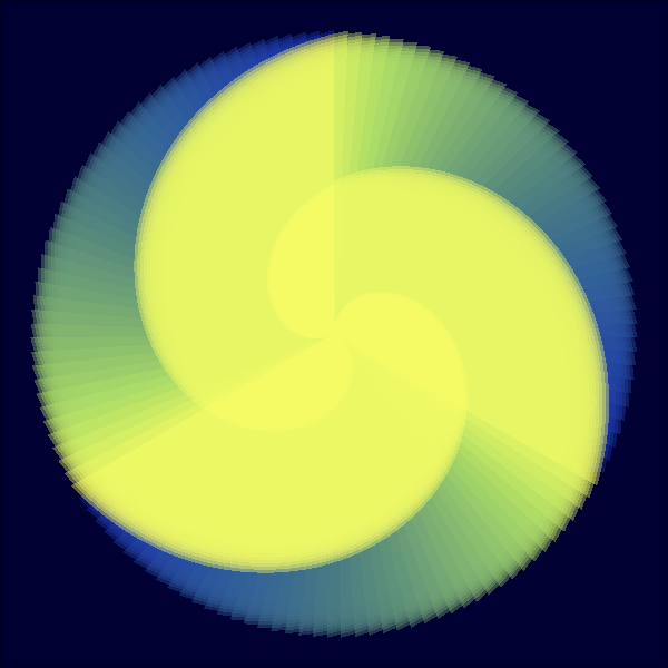
This newest project doesn’t have much to do with data visualization, but I use R for it. I am into Glitch Art  quite some time already. So far, I  used apps or plugins to create my own. BUT this will change now.

I was interested if I could write anything like this on my own. R is probably far from the  optimal tool to work on images, but it is the only programming language I really know, so it must do. The blog Fronkostin did something with images in R recently and inspired me to try it too.

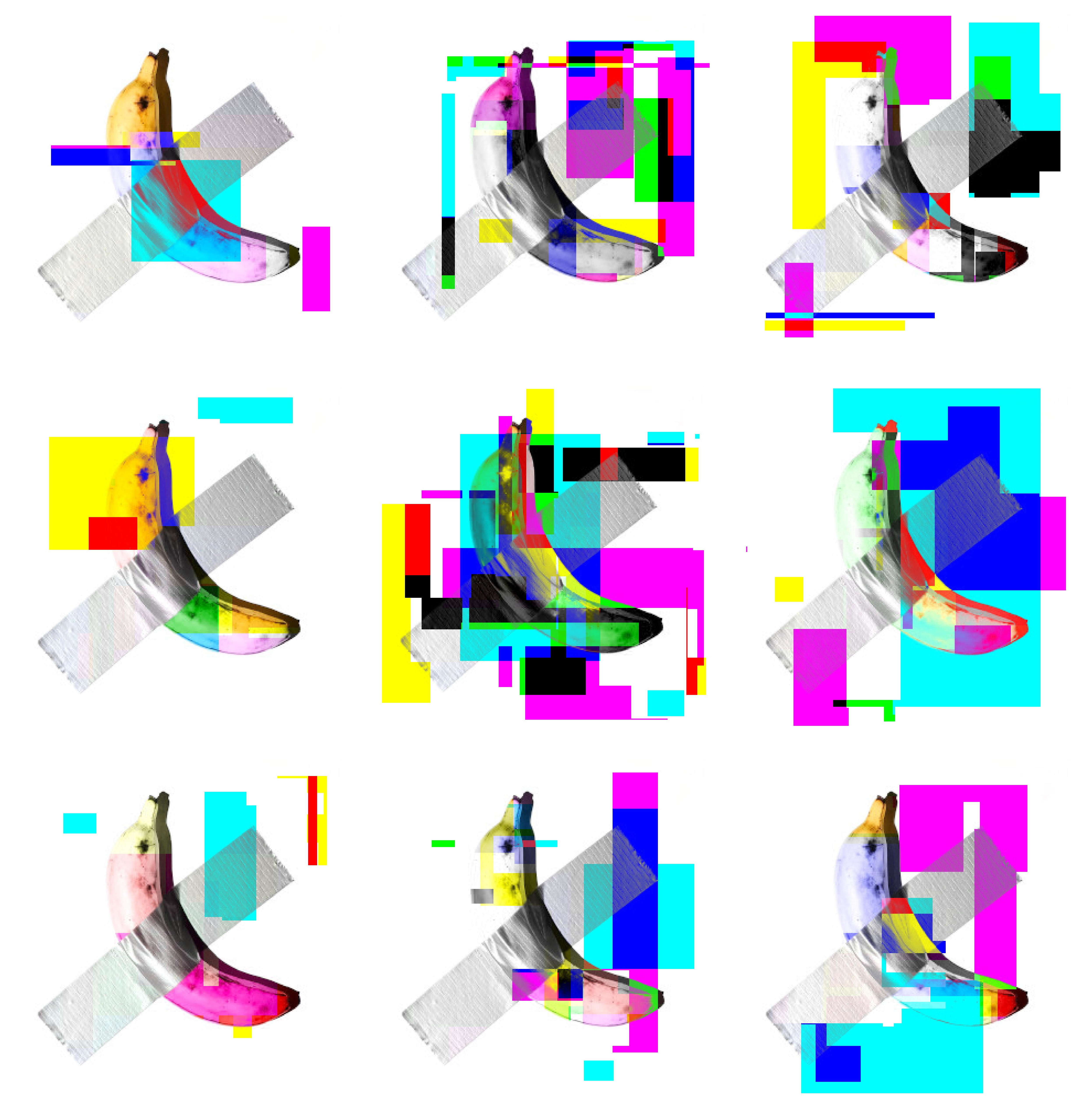
Here is my first try: I basically, selected a random square of the image and randomly shuffled to color channels around (RGB) or inverted them. And then I repeated the progress between 10 and 80 times. It is quite basic, but I love the look of it. And I just love that I can churn them out automatically, randomly creating an infinite amount of variants.  The whole thing is quite slow and is basically unusable with bigger images, but it is a start.

Code

library(imager)
library(tidyverse)

setwd("path")

#convert image to dataframe. Add additional colorchannels, which will be changed.
img=as.data.frame(image,wide="c")%>%rename(red1=c.1,green1=c.2,blue1=c.3)%>%
mutate(red=red1, blue=blue1, green=green1)

 #this function randomly changes colorchannels of random squares. also uses negative of the colorchannel


colorswitches = function(data,negative=T){

#create cordinates for squares. choose randomly two points on the x and y axis. 
liney=sample(1:max(data$y),2)%>%sort()
linex=sample(1:max(data$x),2)%>%sort()

#there are 6 color variables. three of them are the originals. three of them are the ones who are changed
#variable which defines where color is picked from. chooses from orignal and changable variables. it is important that it also picks from original from time to time. because else at one point all becomes grey.
fromcolor=sample(3:8,1)
#randomly selects one of 3 changable variables
tocolor=sample(6:8,1)

#add 1 to 6 chance the negative of the color is used.
minuscolor=ifelse (sample(1:6,1)==1,T,F)

#this is just that the for counter doesn't has to start at one. small speedup
startbla=max(data$x)*(liney[1]-2)
startbla=ifelse(startbla<1,1,startbla)

for(i in startbla:nrow(data)){

#check if x and y is inside the defined square
if (data$y[i] > liney[1]){
if(data$x[i]<linex[2] & data$x[i]>linex[1]){

#two version of changing the color value of the selected channel. one negative on normal. 
if(minuscolor==T &negative==T) data[i,tocolor]=1-data[i,fromcolor]
else data[i,tocolor]=data[i,fromcolor]
}
}
#if y bigger then selected square, stop loop
if(data$y[i]>liney[2]){
break 
}
}
data
}


#repeating the colorsquare function
for(i in 1:50){
img=colorswitches(img)
}


#create proper RGB code from the three color channels
img=img%>% mutate(rgb=rgb(red,green,blue))

#display it with ggplot.
p<- ggplot(img,aes(x,y))+geom_raster(aes(fill=rgb))+scale_fill_identity()+
scale_y_reverse()+
theme_void()
p


Categories
Fun HowTo

Visualizing a Whatsapp-Conversation

In the last post I showed how I imported a Whatsapp-conversation and tidied it up a bit. Now I want to analyze it. For that I will use the libraries dplyr, stringr and ggplot2.

As a first step, I format the dates properly and create some new columns. I also decide to just focus on two years, 2016 and 2017.

data=data%>%mutate(
  #convert DAte to the date format.
        Date=as.Date(Date, "%d.%m.%y"),
        year = format(Date,format="%y"),
        hour =  as.integer(substring(Time,1,2))
        #I filtered for two year, 2016/17
        )%>%filter(year=='17'|year=='16')

ggplot(data,aes(x=hour))+
  geom_histogram(fill="brown",binwidth=1,alpha=0.9)+
  labs(title="Numbers of Messages by Hour", subtitle="Total of two Years",
       y="Number Messages", x="Hour")

See more about the writing behavior of me an my friend, there is more formatting necessary. The words need to be counted too. To do so I use the stringr-library with str_count(data$Message, "\\S+")

Categories
Fun HowTo

Importing a WhatApp-Conversation in R

I recently saw some people on Reddit analyzing their chat-conversations and I wanted to try it too. You can export a Whatsapp-Conversation by sending it as an Email to yourself. You will receive a txt-File with all the conversations. Because it isn’t formatted in a useful manner, you have to do it yourself. I will do this in this post and analyse the data in a second one. So this will be a bit more technical than usual. You can find the complete code here.

Categories
Europe Fun Map Population

A dot-map of Europe

This map is a more leaning on the aesthetic- then data-side. The size of the dots correlates with the size of the population in that place. The color has no meaning and is just there to look nice. For the division of places I used the NUT3 standard which is quite useful, but has its problems if you use it to compare countries.

Categories
Europe Fun Map

Where have I been in 2017

I created this animation in the first days of 2018. A few years ago I accepted that most of my data is stored somewhere. Instead of avoiding this like before, I started to embrace it. In Google Locations for example all the places where you have been are stored (if you didn’t disable it). It can be quite useful to remember what you did a certain day.

This data can also be downloaded and analysed. I didn’t do that, I just wanted to make a nice animation. To do thso at I imported the data it into R with the help of the json-Library. I just chose one value for each day and exported that new data. The next steps could have been done in R too, but I was less experienced with the program back then.

I imported the data to QGIS instead. With the help of the TimeManager-Plugin I exported a frame for each day. I loaded those into Hitfilms Express, which is a fantastic free video-editing software. I used gifmaker.me before to create Gifs, but they have a limit of 300 frames. I exported the video and uploaded it to Gfycat. And here it is.