Categories
Art Generative Art Processing

I started making Art instead of Visualizations

I am back, nearly two years later. I haven’t posted anything here, but I wasn’t idle, I really got into Generative Art and shared it on Instagram. I posted over 200 Images in the last two years, all based on my code!

When you look at my last three posts, you see that I started to dabble in Generative / Glitch art. I was using R, because I was most familiar with the tool. I realized soon, that it might not be the ideal tool. I started looking into Processing.

Processing is a programming language based on Java. It was designed as an intro to programming with a strong visual emphasis. It is quite popular in the Generative Art space, which is why I made the leap. After some struggle at the beginning, it proved to be quite easy to learn. There are a lot of good tutorials


Sieh dir diesen Beitrag auf Instagram an


Ein Beitrag geteilt von infobil (@inf0bil)

But that wasn’t all: I learnt about Pen Plotters, machines that do the drawing for you and are quite popular with generative artists. Basically, it is a machine that can draw with a pen and can draw vector graphics.

I was fascinated and bought one for myself. I am now an owner of an Axidraw A3 by Evil Mad Scientists. I started plotting and I still am today. After doing this for two years, I thought it might be time to write up some things I learnt.

Categories
Art Fun Generative Art R

I created a shiny app for R. It generates colourful circles

I tried making a shiny app about 2 years ago, but I never really got it online for some reason. But after talking to a friend I tried again and it was surprisingly easy! Maybe I just got a lot better using R or the server infrastructure got a lot easier to use.

Anyway here you can play around with it.

I still could improve a few things UI-vice and maybe add more options. But honestly for a prove of concept it is good enough and I am quite happy how well it works. And I really like the results.

Categories
Chart R

I tracked my Podcast-listening for one year

I listen to podcasts all the time. But I didn’t really have a clue how much time I spend on it and what kind of podcasts I am even listening. So I started to track my habits. To do so I switched my podcast-app to Podcast-Addict. The app tracks how much time you spent on each podcast. Unfortunately there is no way to properly export that data, so I had to type in the times manually once a month. I did that for one and a half year of which I used one year. (My phone broke so there was a 10 days gap and I thought one year is prettier anyway.)

The main problem was that the interesting information was which podcast I listen to and how much. But at the same time there were 75 of them, too many to give space to all of them, because it would look to crowded. I tried anyway and the result is the graph “Podcasts by Category”. And it definitely is too crowded, but I am still quite happy with it because it manages to show a lot of information at once without being too confusing.

An alternative was to summarize the Podcast into categories, but this would be mainly interesting for myself but for no one else, also because the categorization is a bit arbitrary at times. For me, the result was interesting: I could clearly recognize the time I was working, the time I started my master thesis and the time in between. In the month with the huge spike I went back to university but most of my friends weren’t back yet. I was also listening to the Versailles Anniversary Project (100 years), which followed the making of the Versailles treaties nearly day by day and because I started a month to late I had a lot of catch up to do (amazing work by the way. Check it out)

One goal of this visualization was to try to properly apply one theme to all the graphs, so they look like they belong together. I think that worked quite well beside some minor errors. I also tried to get better at using colours. I wasn’t to successful there, the colours I used in the end  for the languages are quite ugly and I should have played around with it a little longer.

Categories
Generative Art R

Generating beautiful patterns with R

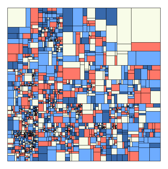
Motivated by my last experiments with Glitch Art I decided to look a bit more into generating images with R. One of my favorite musicians Max Cooper released another absolutely gorgeous music video. Check it out, the animation is fantastic. I was intrigued by the simple basic structure. It was just a rectangle divided by rectangles divided by rectangles. Something I can absolutely do with my R skills. So, I tried. The pictures are a result of that.

My tactic was to create a data frame just starting with the first rectangle, defined by start and end coordinates then just splitting them. I filled them randomly with colors. Honestly quite simple. Doing this and other experiments, I got a lot better making code run faster in R. Of course there is still a lot of space to improve. The code in my last post for example was super inefficient and I made a lot of basic mistakes (I improved it and now it runs a lot faster).

Here is the code if anyone is interested:

library(tidyverse)

rectanglesplitter=function(data,i){
#data is one line of the total dataset, i is the number of the loop.
#because I don't want super long rectangles, I always first check which is the longe side.
yaxsplit=ifelse((data$z.x-data$a.x)^2>=(data$z.y-data$a.y)^2,F,T )
#create the divider which is a value which defines the proportions of the two new rectangles
divider=1/(random[i]+1)

#rectangle 1
########
#ifelse is necessary to change if it is a vertical split or not.
#here the new x.a1 and new y.a1 is created. (naming was a bit stupid I admit)
data[2,1]=ifelse(yaxsplit==T, data[1,1] , data[1,1]+(data[1,3]-data[1,1])*divider)
data[2,2]=ifelse(yaxsplit==T, data[1,2]+(data[1,4]-data[1,2])*divider, data[1,2])

#Points stay stay the same no mater the orientation.
#x.z1 and y.z1 are created
data[2,3]=data[1,3]
data[2,4]=data[1,4]

#rectangle 2
#are the same like in the first created recangle (x.a and y.a)
data[3,1]= data[2,1]
data[3,2]= data[2,2]
#y.z2 and y.z2 
data[3,3]=ifelse(yaxsplit==T, data[1,3] , data[1,1] )
data[3,4]=ifelse(yaxsplit==T, data[1,2] , data[1,4])


#add level (for potential animations)
data[2,5]=i
data[3,5]=i
#add a color. one of the rectangles keeps the color of the bigger rectangle, not necessary
data[2,6]=random[i]
data[3,6]=data[1,6]

#this changes which one of the rectangles is saved first. this should change it up and make sure there aren't more splits on one side.
if(random[i]%%2==0){
data[3:2,]
}
else{data[2:3,]}
}

# a list of color palettes
pallist=list(
palette=c("black","#CDCFE2","#423E6E","#FF352E"),
palette=c("#233142","#455d7a","#f95959","#e3e3e3",NA)
)

#how many splits should be done?
loops=50000
#create empty dataframe
df=data.frame(a.x=rep(NA,loops*2),
a.y=NA,
z.x=NA,
z.y=NA,
level=NA,
color=NA,
alpha=NA)
#fill first row
df[1,]=c(0,0,100,100,1,1,1)


#precreate random vector used for proportions and colors.
random=sample(1:4,loops,replace = T)

i=1
while(i <loops){
#filling up dateframe with simple loop and splitter functions
df[((2*i):((2*i)+1)),]=rectanglesplitter(df[i,],i)

#this skips every few rows, so there stay a few bigger rectangles.
i=ifelse(i%%17==0&i>881,i+2,i+1)
}


#this is just for me to choose one palettes in the list
farbe=1
ggplot(df)+
geom_rect(aes(xmin=a.x,ymin=a.y,xmax=z.x,ymax=z.y),
alpha=9,show.legend = F,fill=pallist[[farbe]][df$color],col=pallist[[farbe]][5])+
coord_fixed()+
theme_void()
Categories
Map Travel

Where have I been in 2018

Last year I made a post about where I have been in 2017. I was worse with R so I solved it with a combination of cleaning up the data with R, importing it into Qgis and finally edited it in HitFilms.

This time I just did it all in R. The difficult part this time was to get the Google API running for the import of Google maps. (You need to enable billing to get the whole thing running.) It was the first time I used the new ggAnimate. It is great and easy to use. Less of a hazzle then the last times I used it.

I could reuse some of last years code, so I was done quite fast. (not the greatest code tough.)


library(tidyverse)
library(jsonlite)
library(ggplot2)
library(ggmap)
library(gganimate)
library(gifski)
library(zoo)
library(lubridate)

register_google(key = “AIzaSyCTCk3yYCPEo1UKVkZm_iQk_r4wPJCHlA4”)

system.time(x <- fromJSON(“GoogleLoc.json”))

# extracting the locations dataframe
loc = x$locations

# converting time column from posix milliseconds into a readable time scale
loc$time = as.POSIXct(as.numeric(x$locations$timestampMs)/1000, origin = “1970-01-01”)

# converting longitude and latitude from E7 to GPS coordinates
loc$lat = loc$latitudeE7 / 1e7
loc$lon = loc$longitudeE7 / 1e7

# calculate the number of data points per day, month and year
loc$date <- as.Date(loc$time, ‘%Y/%m/%d’)
loc$year <- year(loc$date)
loc$month_year <- as.yearmon(loc$date)

#new dataframe with the important units
maps<- data.frame(loc$lat,loc$long,loc$date,loc$time,loc$year)

#filter out the year and convert the longitude to the proper unit.
maps1<-maps%>%filter(loc.year==2018) %>% mutate(longitude = loc.long/10^7)

#choose the 10. measurement of each day. not very elegant, but good enough.
maps2<- maps1 %>% group_by(loc.date) %>%
summarise(long=(longitude[10]),
lat=(loc.lat[10]))

#get background map. set size, zoom, kind of map)
mamap <- get_map(location=c(mean(maps2$long,na.rm=T),mean(maps2$lat,na.rm=TRUE)+3), maptype = “satellite”,zoom=5)

#put it all together.
ggmap(mamap)+
geom_point(data=maps2,aes(x=long,y=lat),size=4, col=”red”)+
geom_label(data=maps2,x=1.5,y=56,aes(label=format(as.Date(loc.date),format=”%d.%m”)),size=10,col=”black”)+
theme_void()+
#the animation part
transition_time(loc.date)+
shadow_trail(alpha=0.3,colour=”#ff695e”,size=2,max_frames = 6)

a=animate(m, renderer = ffmpeg_renderer(),duration=20)
anim_save(filename = “my2018/2018video.mp4”)

Categories
Chart Europe Population

To which European countries do Europeans migrate?


Migration is a huge topic in Europe and I wanted to know where people go, when they leave the country they grew up in. Luckily Eurostat has some Data about that.

There is the problem of huge population differences between the countries, so I wasn’t able to just use the absolut numbers. So I created to graphs. Once it show the migrant-population  relative to the host country and once relative to their origin country.


I created the graphs with the help of R and Ggplot. Code of the second graph:

ggplot(mig1,aes(y=Host,x=Origin,fill=sharehostpop))+
 geom_raster()+
 theme_gray()+
 coord_equal()+
 scale_fill_distiller(palette="YlOrRd", direction = 1,na.value=NA,trans='log1p')+
 theme( 
 axis.text.x=element_text(angle = 45, hjust=.1),
 legend.position = "bottom")+
scale_x_discrete(position="top")+
 scale_y_discrete(limits=names(table(droplevels(mig1$Host)))[length(names(table(droplevels(mig1$Host)))):1])+
 labs(y="Host-Country",x="Origin-Country",fill="Share of Population in Host-Country (%)",
 title="Biggest groups of European immigrants in Europe (2017)",caption="Note: Missing countries had no Data avaible or were so small, that they distored the scale.
 Source: Eurostat")
Categories
Fun HowTo

Visualizing a Whatsapp-Conversation

In the last post I showed how I imported a Whatsapp-conversation and tidied it up a bit. Now I want to analyze it. For that I will use the libraries dplyr, stringr and ggplot2.

As a first step, I format the dates properly and create some new columns. I also decide to just focus on two years, 2016 and 2017.

data=data%>%mutate(
  #convert DAte to the date format.
        Date=as.Date(Date, "%d.%m.%y"),
        year = format(Date,format="%y"),
        hour =  as.integer(substring(Time,1,2))
        #I filtered for two year, 2016/17
        )%>%filter(year=='17'|year=='16')

ggplot(data,aes(x=hour))+
  geom_histogram(fill="brown",binwidth=1,alpha=0.9)+
  labs(title="Numbers of Messages by Hour", subtitle="Total of two Years",
       y="Number Messages", x="Hour")

See more about the writing behavior of me an my friend, there is more formatting necessary. The words need to be counted too. To do so I use the stringr-library with str_count(data$Message, "\\S+")

Categories
Fun HowTo

Importing a WhatApp-Conversation in R

I recently saw some people on Reddit analyzing their chat-conversations and I wanted to try it too. You can export a Whatsapp-Conversation by sending it as an Email to yourself. You will receive a txt-File with all the conversations. Because it isn’t formatted in a useful manner, you have to do it yourself. I will do this in this post and analyse the data in a second one. So this will be a bit more technical than usual. You can find the complete code here.

Categories
Europe Fun Map Population

A dot-map of Europe

This map is a more leaning on the aesthetic- then data-side. The size of the dots correlates with the size of the population in that place. The color has no meaning and is just there to look nice. For the division of places I used the NUT3 standard which is quite useful, but has its problems if you use it to compare countries.

Categories
Map Switzerland

The Trams of Zurich animated

After I saw a great post on /r/dataisbeautiful where someone mapped a place with the help of location-data of rented bicycles, I searched if there is some similar data available where I live.