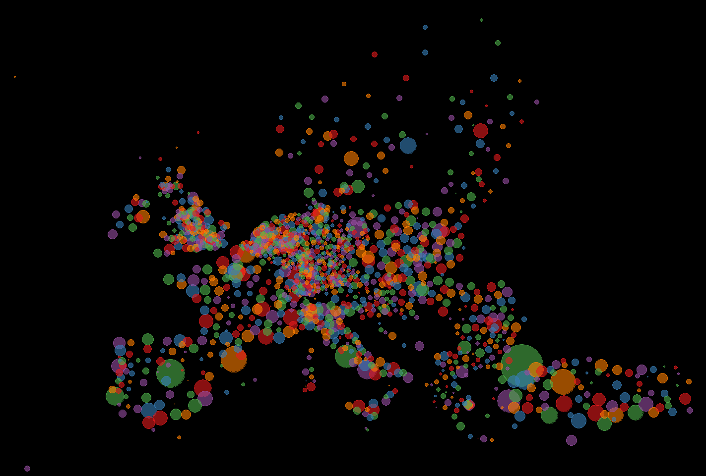
This map is a more leaning on the aesthetic- then data-side. The size of the dots correlates with the size of the population in that place. The color has no meaning and is just there to look nice. For the division of places I used the NUT3 standard which is quite useful, but has its problems if you use it to compare countries.