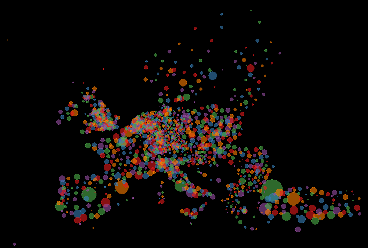
This map is a more leaning on the aesthetic- then data-side. The size of the dots correlates with the size of the population in that place. The color has no meaning and is just there to look nice. For the division of places I used the NUT3 standard which is quite useful, but has its problems if you use it to compare countries.
Here you can see how NUT3 divides countries:
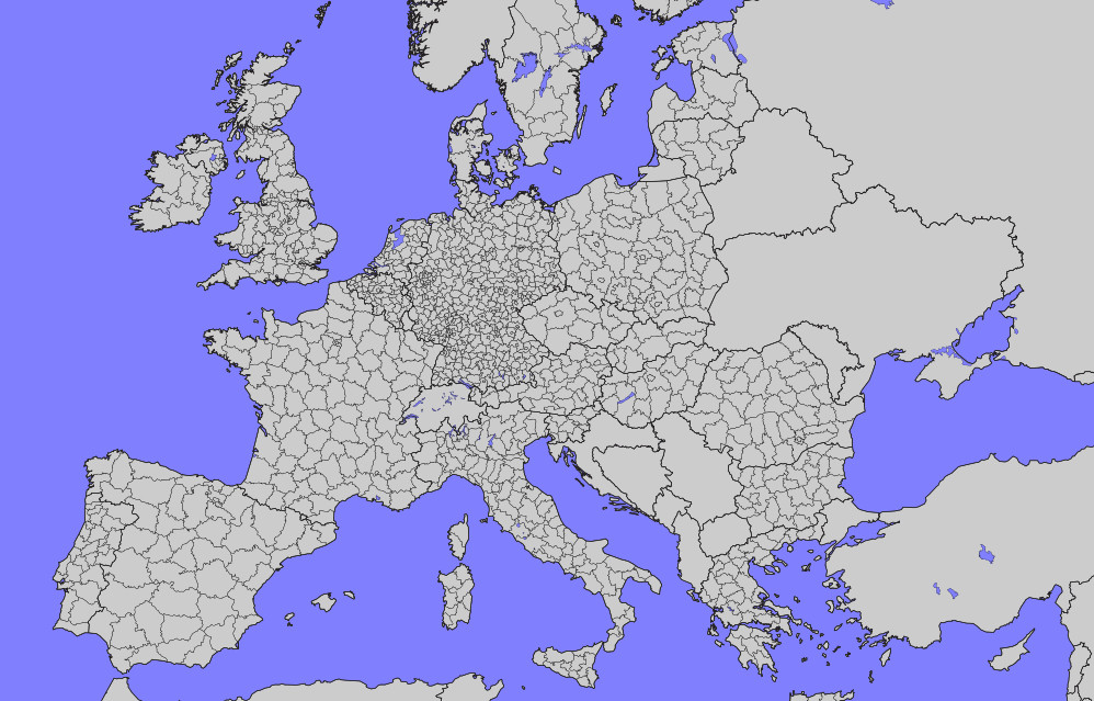 How the regions are divided depends on the country. Paris for example is divided into several units, while Madrid is just one. This makes comparing them quite difficult. There are also a few European countries missing like Ukraine and some Balkan-states. So it is far from perfekt, but good enough for a nice colorful map of Europe.
I created it with the help of R and ggplot and depended on data from Eurostat. I created an animation of it with the help of gganimate.