Categories
Map Travel

Where have I been in 2018

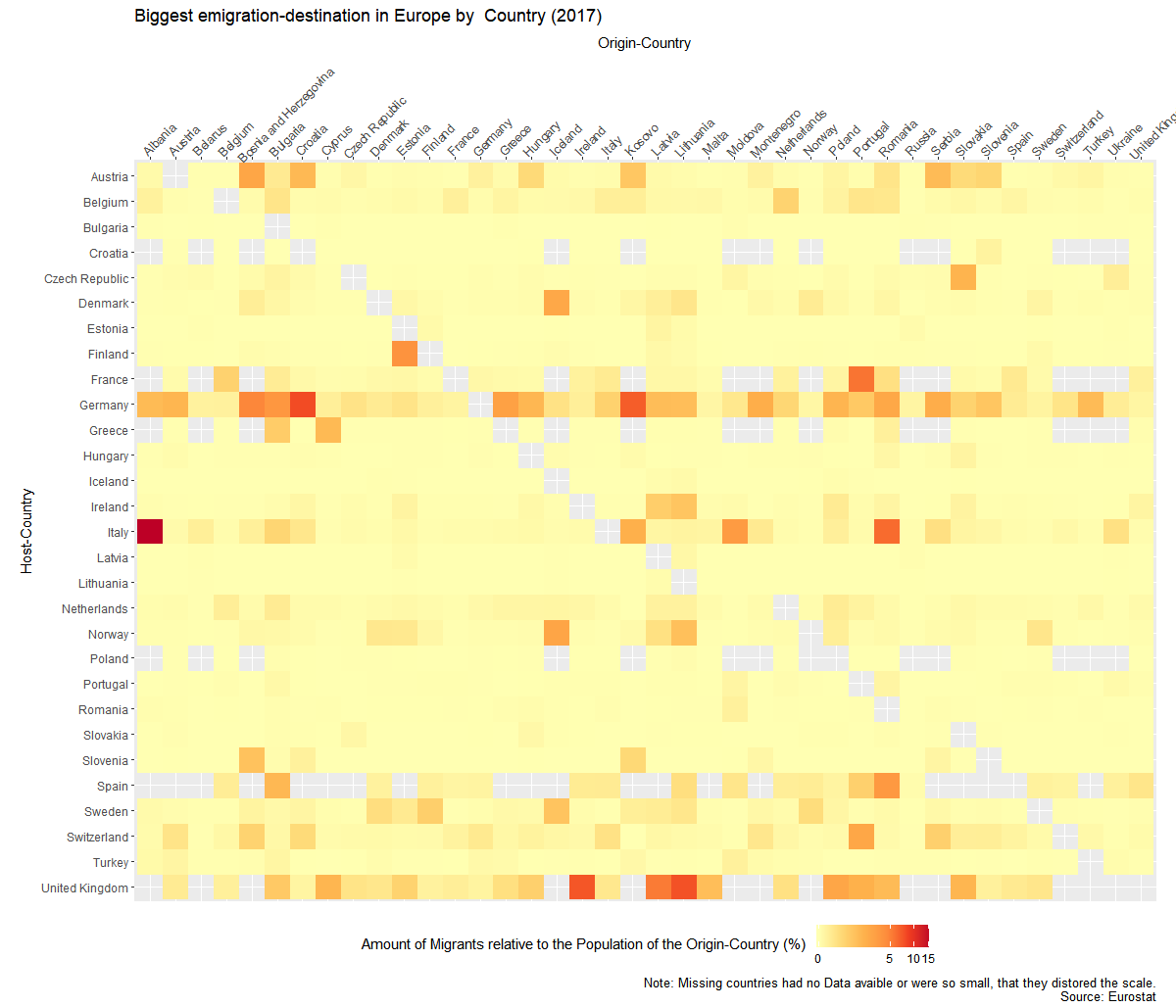
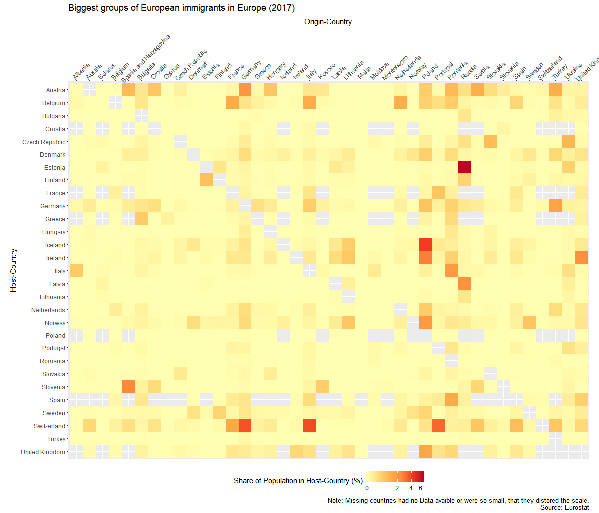
Last year I made a post about where I have been in 2017. I was worse with R so I solved it with a combination of cleaning up the data with R, importing it into Qgis and finally edited it in HitFilms.

This time I just did it all in R. The difficult part this time was to get the Google API running for the import of Google maps. (You need to enable billing to get the whole thing running.) It was the first time I used the new ggAnimate. It is great and easy to use. Less of a hazzle then the last times I used it.

I could reuse some of last years code, so I was done quite fast. (not the greatest code tough.)


library(tidyverse)
library(jsonlite)
library(ggplot2)
library(ggmap)
library(gganimate)
library(gifski)
library(zoo)
library(lubridate)

register_google(key = “AIzaSyCTCk3yYCPEo1UKVkZm_iQk_r4wPJCHlA4”)

system.time(x <- fromJSON(“GoogleLoc.json”))

# extracting the locations dataframe
loc = x$locations

# converting time column from posix milliseconds into a readable time scale
loc$time = as.POSIXct(as.numeric(x$locations$timestampMs)/1000, origin = “1970-01-01”)

# converting longitude and latitude from E7 to GPS coordinates
loc$lat = loc$latitudeE7 / 1e7
loc$lon = loc$longitudeE7 / 1e7

# calculate the number of data points per day, month and year
loc$date <- as.Date(loc$time, ‘%Y/%m/%d’)
loc$year <- year(loc$date)
loc$month_year <- as.yearmon(loc$date)

#new dataframe with the important units
maps<- data.frame(loc$lat,loc$long,loc$date,loc$time,loc$year)

#filter out the year and convert the longitude to the proper unit.
maps1<-maps%>%filter(loc.year==2018) %>% mutate(longitude = loc.long/10^7)

#choose the 10. measurement of each day. not very elegant, but good enough.
maps2<- maps1 %>% group_by(loc.date) %>%
summarise(long=(longitude[10]),
lat=(loc.lat[10]))

#get background map. set size, zoom, kind of map)
mamap <- get_map(location=c(mean(maps2$long,na.rm=T),mean(maps2$lat,na.rm=TRUE)+3), maptype = “satellite”,zoom=5)

#put it all together.
ggmap(mamap)+
geom_point(data=maps2,aes(x=long,y=lat),size=4, col=”red”)+
geom_label(data=maps2,x=1.5,y=56,aes(label=format(as.Date(loc.date),format=”%d.%m”)),size=10,col=”black”)+
theme_void()+
#the animation part
transition_time(loc.date)+
shadow_trail(alpha=0.3,colour=”#ff695e”,size=2,max_frames = 6)

a=animate(m, renderer = ffmpeg_renderer(),duration=20)
anim_save(filename = “my2018/2018video.mp4”)

Categories
Chart Europe Population

To which European countries do Europeans migrate?


Migration is a huge topic in Europe and I wanted to know where people go, when they leave the country they grew up in. Luckily Eurostat has some Data about that.

There is the problem of huge population differences between the countries, so I wasn’t able to just use the absolut numbers. So I created to graphs. Once it show the migrant-population  relative to the host country and once relative to their origin country.


I created the graphs with the help of R and Ggplot. Code of the second graph:

ggplot(mig1,aes(y=Host,x=Origin,fill=sharehostpop))+
 geom_raster()+
 theme_gray()+
 coord_equal()+
 scale_fill_distiller(palette="YlOrRd", direction = 1,na.value=NA,trans='log1p')+
 theme( 
 axis.text.x=element_text(angle = 45, hjust=.1),
 legend.position = "bottom")+
scale_x_discrete(position="top")+
 scale_y_discrete(limits=names(table(droplevels(mig1$Host)))[length(names(table(droplevels(mig1$Host)))):1])+
 labs(y="Host-Country",x="Origin-Country",fill="Share of Population in Host-Country (%)",
 title="Biggest groups of European immigrants in Europe (2017)",caption="Note: Missing countries had no Data avaible or were so small, that they distored the scale.
 Source: Eurostat")
Categories
Europe Fun Map Population

A dot-map of Europe

This map is a more leaning on the aesthetic- then data-side. The size of the dots correlates with the size of the population in that place. The color has no meaning and is just there to look nice. For the division of places I used the NUT3 standard which is quite useful, but has its problems if you use it to compare countries.

Categories
Chart Europe Population

Growth of European Countries relative to 1950


How did the populations of European countries grow after the end of the 2nd world-war? To answer this question I downloaded population-data from the United Nations. I picked 1950 as my default year and looked how it developed from there.

Categories
Europe Map

Population Density in Europe

This map was made with the help of the data of Eurostat. The subdivisions of the countries follows NUTS 3 standards. I used a quantil-scale, which means each colors has about the same number of regions.

Categories
Europe Map

How much do the countries of Europe invest in R&D?

I created this map some weeks ago with a dataset from the OECD. I wanted to visualize the role of research and development (R&D) in different European countries. The results aren’t to surprising: There seems to be a correlation with the wealth of the country. Switzerland is the country which spends the most on R&D.

Colors and the number of the countries have a different meaning, which is rather confusing.  I tried to put more information on the map, but I have to think of a better way in the future. And I made two mistakes: I didn’t show clearly  that the was no data for Ireland and I used a map-shapefile which labeled the Krim as Russian territory.