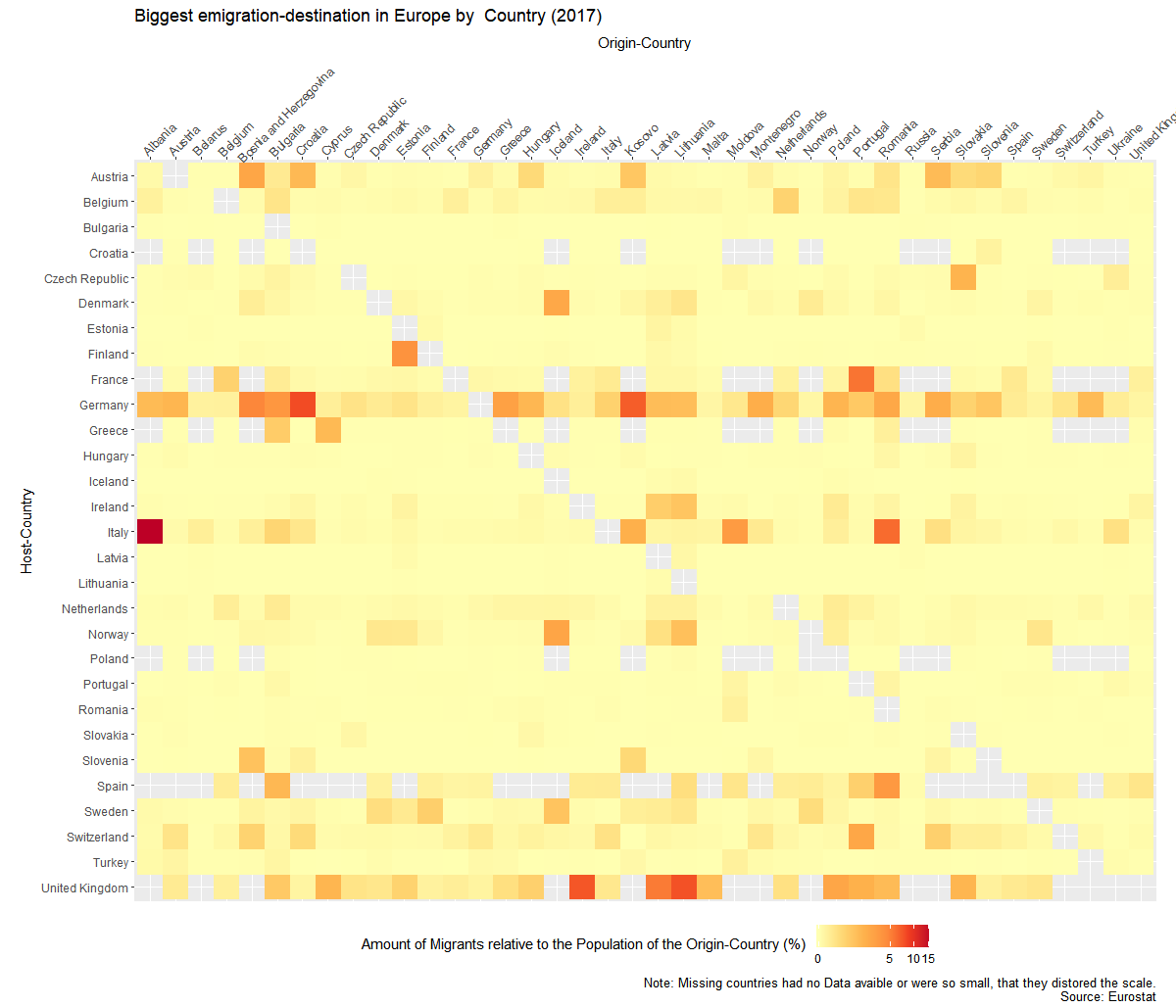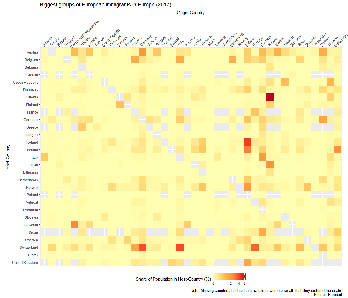
Migration is a huge topic in Europe and I wanted to know where people go, when they leave the country they grew up in. Luckily Eurostat has some Data about that.
There is the problem of huge population differences between the countries, so I wasn’t able to just use the absolut numbers. So I created to graphs. Once it show the migrant-population relative to the host country and once relative to their origin country.

I created the graphs with the help of R and Ggplot. Code of the second graph:
ggplot(mig1,aes(y=Host,x=Origin,fill=sharehostpop))+
 geom_raster()+
 theme_gray()+
 coord_equal()+
 scale_fill_distiller(palette="YlOrRd", direction = 1,na.value=NA,trans='log1p')+
 theme(
 axis.text.x=element_text(angle = 45, hjust=.1),
 legend.position = "bottom")+
scale_x_discrete(position="top")+
 scale_y_discrete(limits=names(table(droplevels(mig1$Host)))[length(names(table(droplevels(mig1$Host)))):1])+
 labs(y="Host-Country",x="Origin-Country",fill="Share of Population in Host-Country (%)",
 title="Biggest groups of European immigrants in Europe (2017)",caption="Note: Missing countries had no Data avaible or were so small, that they distored the scale.
 Source: Eurostat")
