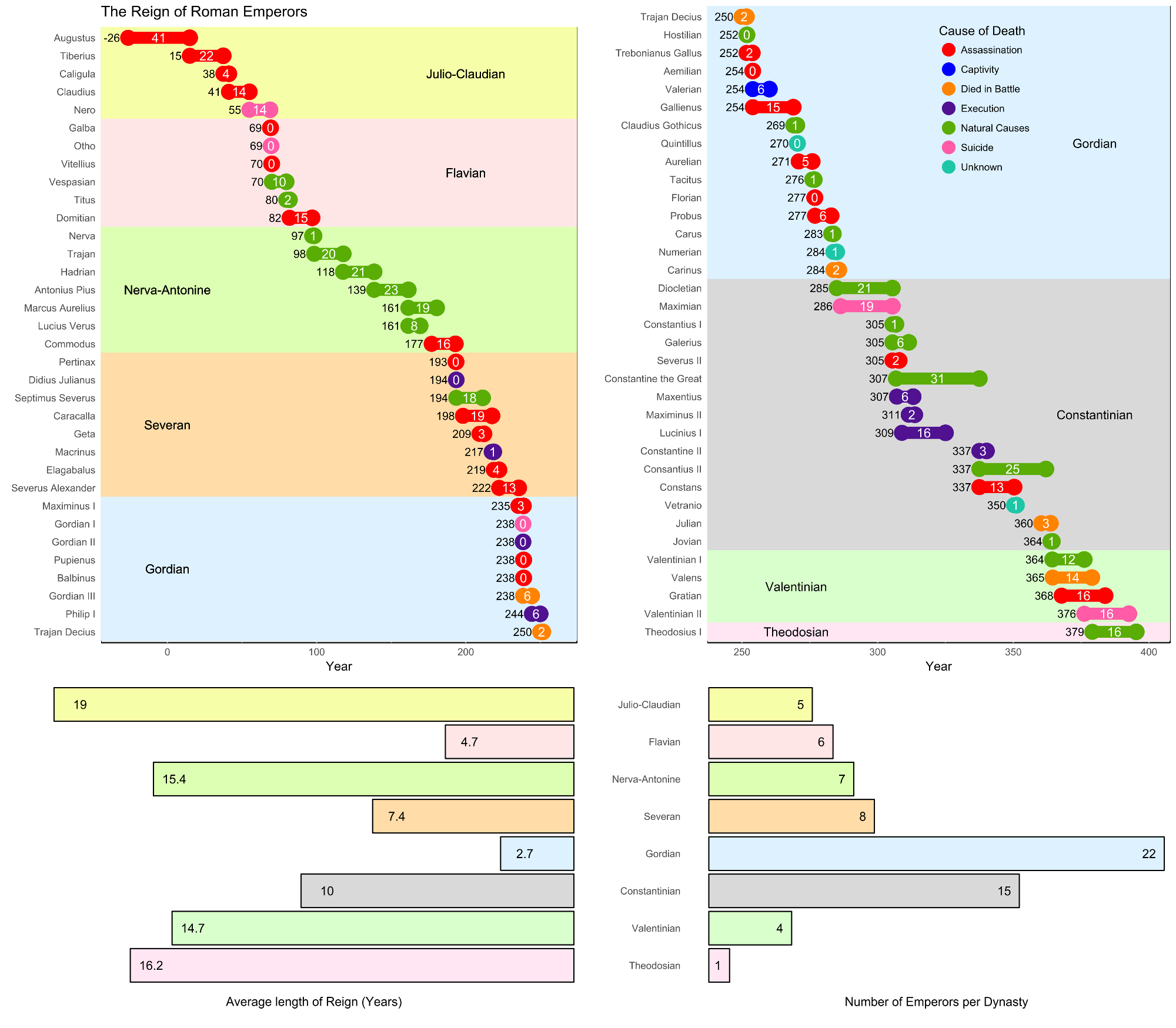
I visualized the reign and end of Roman emperors. I am quite a fan of history, so when the task in the /r/dataisbeautiful-DataViz-Battle was to visualize the reigns of the Roman Empire, I was excited.
I created it as usual with the help of R and ggplot. It was the first time I worked with this kind of graph and changed background colors. Because there were so many emperors, I didn’t want to put them all in one chart. My solution was to split it in two, which caused some other problems . Another problem was properly labeling the dynasties. I tried several thing, which didn’t really work. At the end I just wrote down the sizes of the background-boxes by hand. That was a bit tedious, but still more efficient then trying around some more. (I think there were some bugs too somewhere)
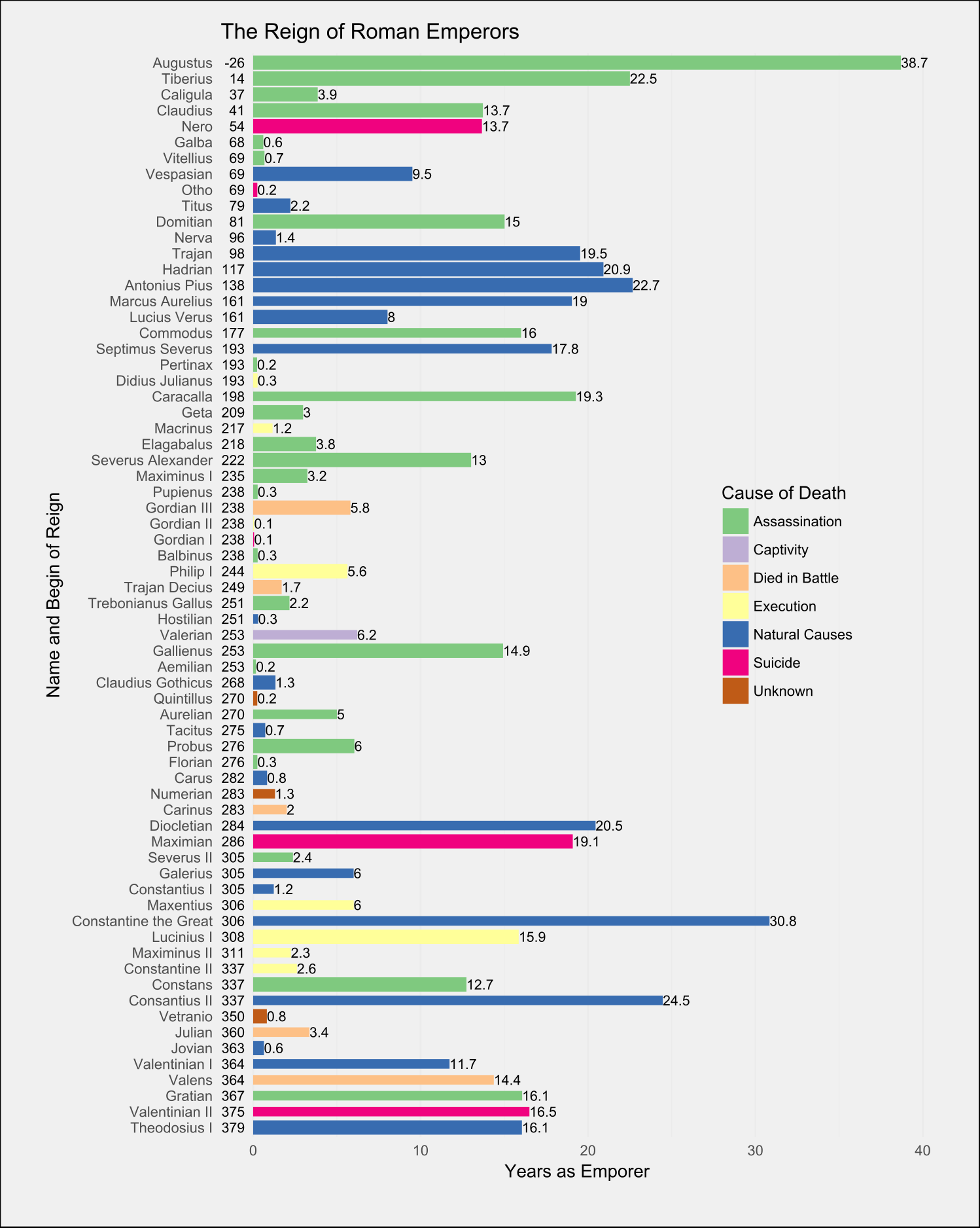
This is actually my second try. I abandoned my first one, because I wasn’t happy how several emperors at the same time were displayed. You can see it below.