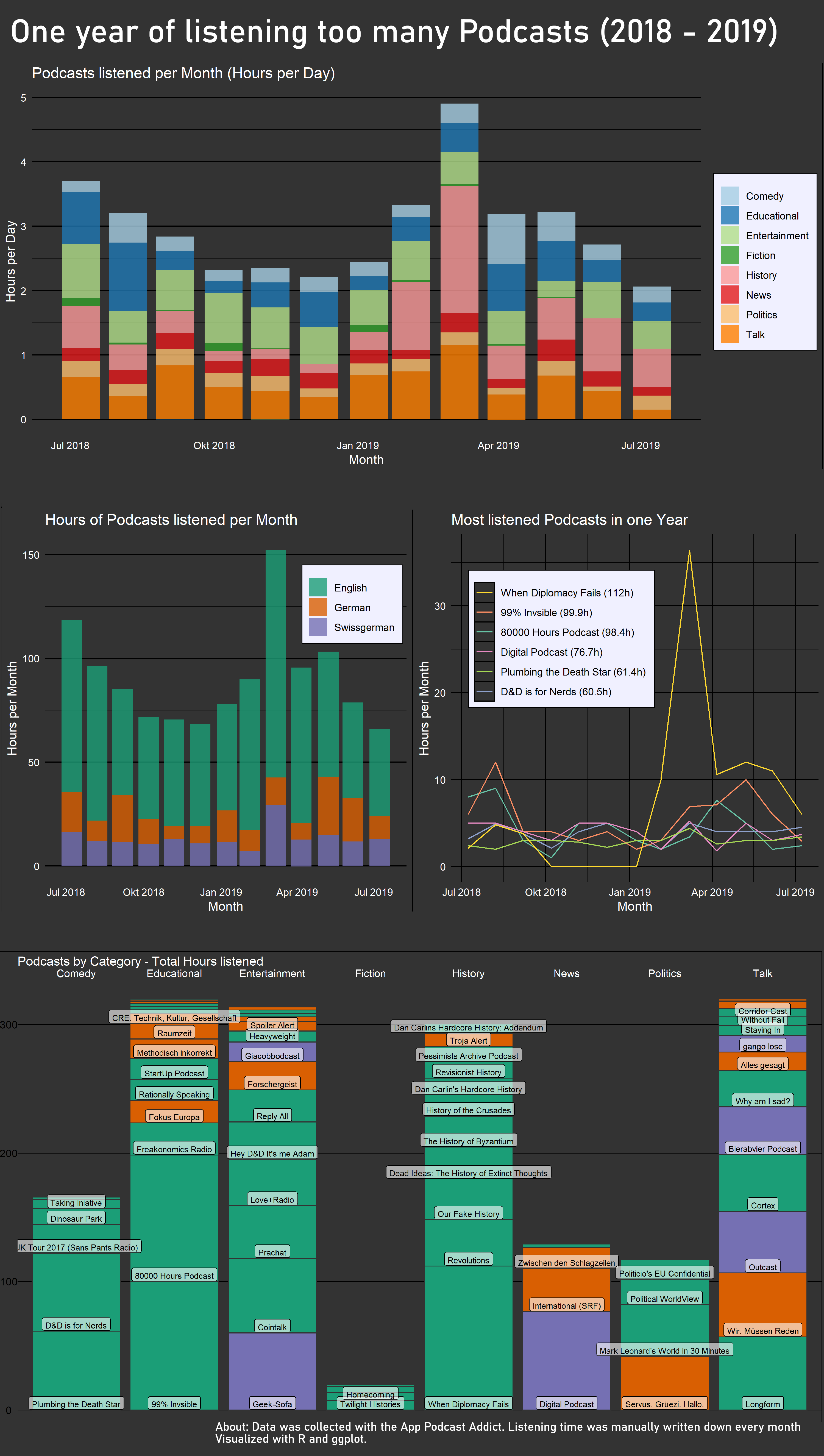
I listen to podcasts all the time. But I didn’t really have a clue how much time I spend on it and what kind of podcasts I am even listening. So I started to track my habits. To do so I switched my podcast-app to Podcast-Addict. The app tracks how much time you spent on each podcast. Unfortunately there is no way to properly export that data, so I had to type in the times manually once a month. I did that for one and a half year of which I used one year. (My phone broke so there was a 10 days gap and I thought one year is prettier anyway.)
The main problem was that the interesting information was which podcast I listen to and how much. But at the same time there were 75 of them, too many to give space to all of them, because it would look to crowded. I tried anyway and the result is the graph “Podcasts by Category”. And it definitely is too crowded, but I am still quite happy with it because it manages to show a lot of information at once without being too confusing.
An alternative was to summarize the Podcast into categories, but this would be mainly interesting for myself but for no one else, also because the categorization is a bit arbitrary at times. For me, the result was interesting: I could clearly recognize the time I was working, the time I started my master thesis and the time in between. In the month with the huge spike I went back to university but most of my friends weren’t back yet. I was also listening to the Versailles Anniversary Project (100 years), which followed the making of the Versailles treaties nearly day by day and because I started a month to late I had a lot of catch up to do (amazing work by the way. Check it out)
One goal of this visualization was to try to properly apply one theme to all the graphs, so they look like they belong together. I think that worked quite well beside some minor errors. I also tried to get better at using colours. I wasn’t to successful there, the colours I used in the end for the languages are quite ugly and I should have played around with it a little longer.