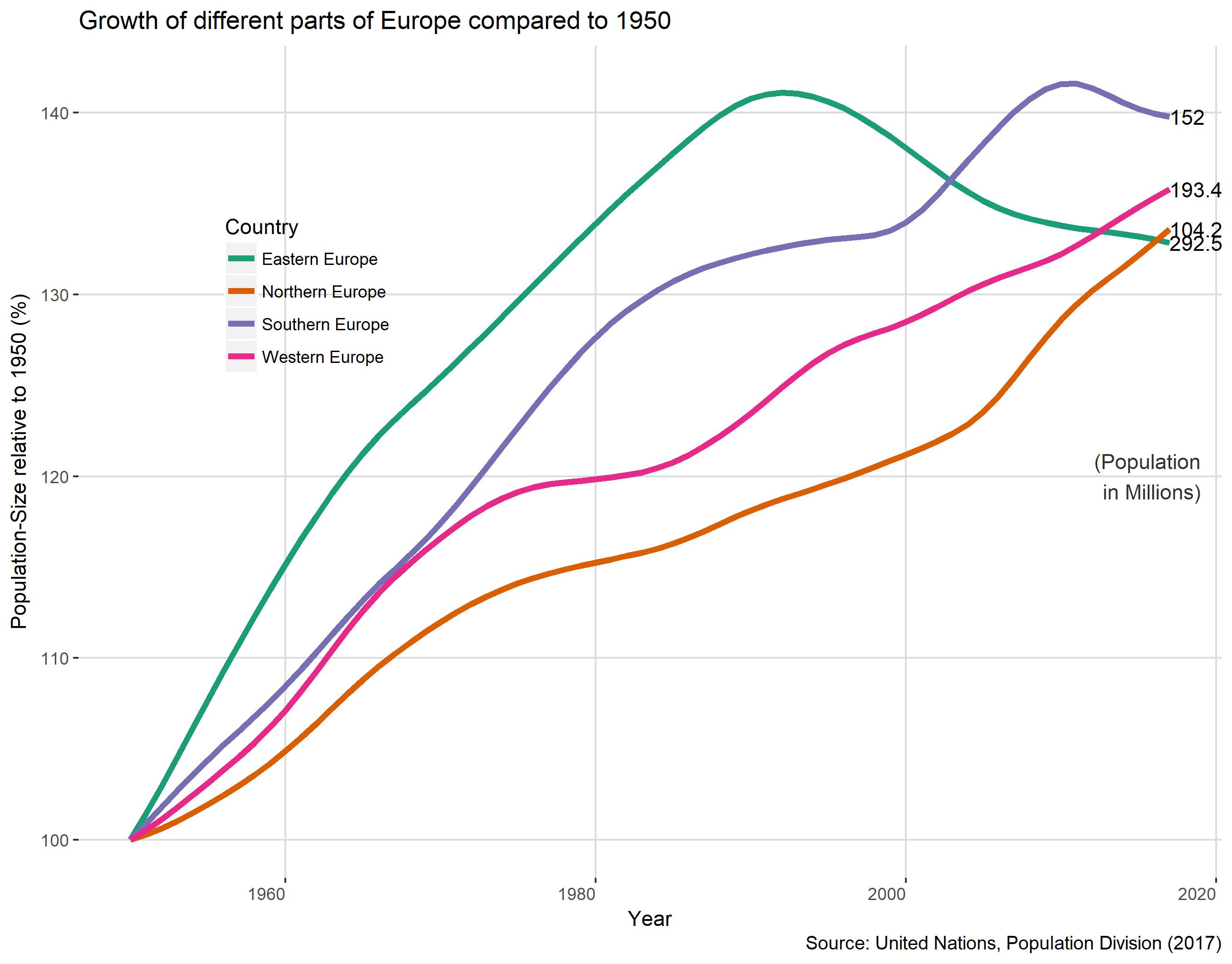
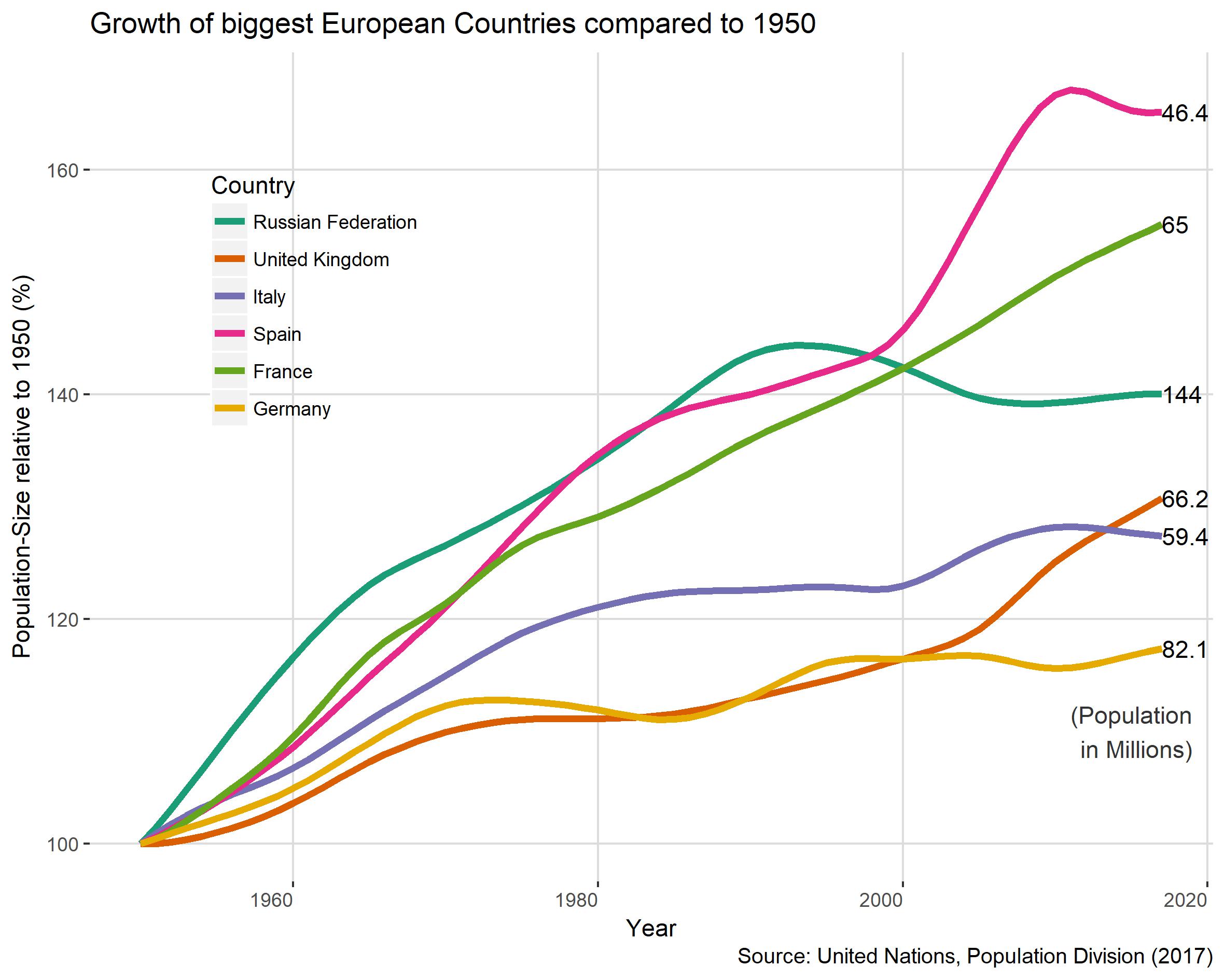
How did the populations of European countries grow after the end of the 2nd world-war? To answer this question I downloaded population-data from the United Nations. I picked 1950 as my default year and looked how it developed from there.
Program and Problems
To create this charts I used R. I had a big “Aha”-moment, when I stumbled over a blog-post about tidy data. I wish I knew about it before, it would have saved me tons of time. Here is the tidied data.
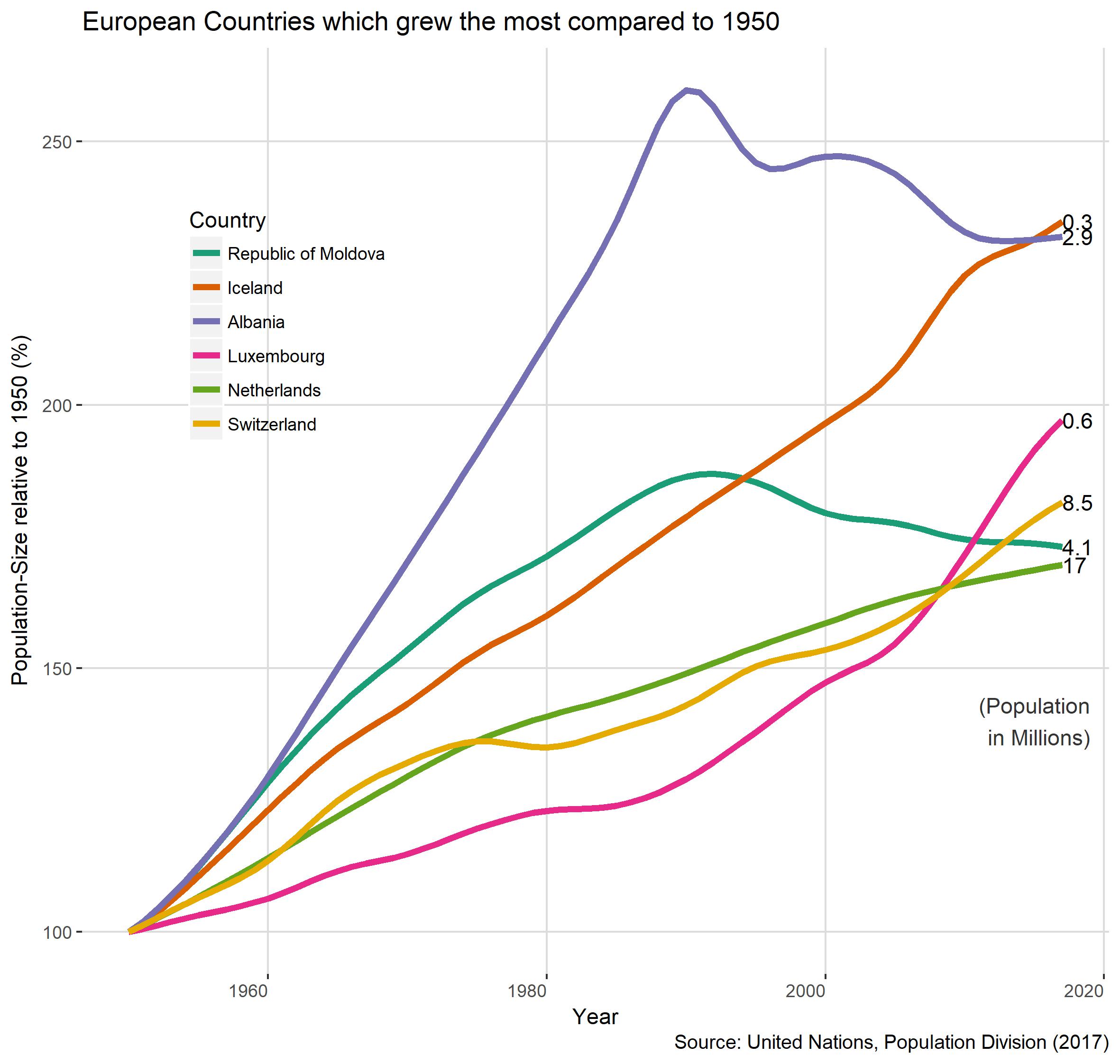
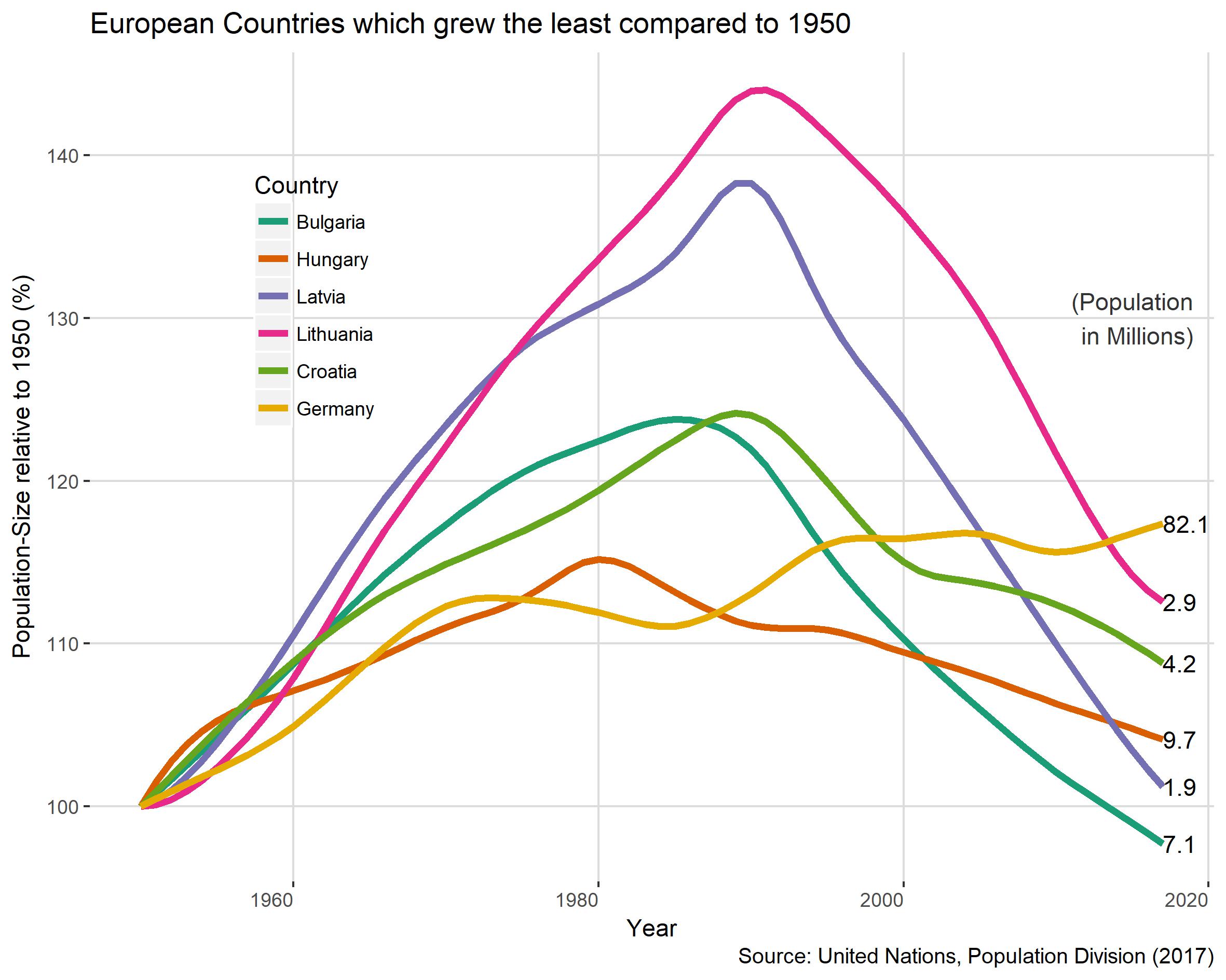
To create the charts I used ggplot. I did many of different versions. I first tried to make one chart of each European Region. That didn’t work at all, because there were more then 10 lines in each Plot. I tried a lot of different things, like interactive charts with plotly or dotted lines, but it was just cluttered. So I changed my mind, organised the charts differently and just use six, which keeps in readable.
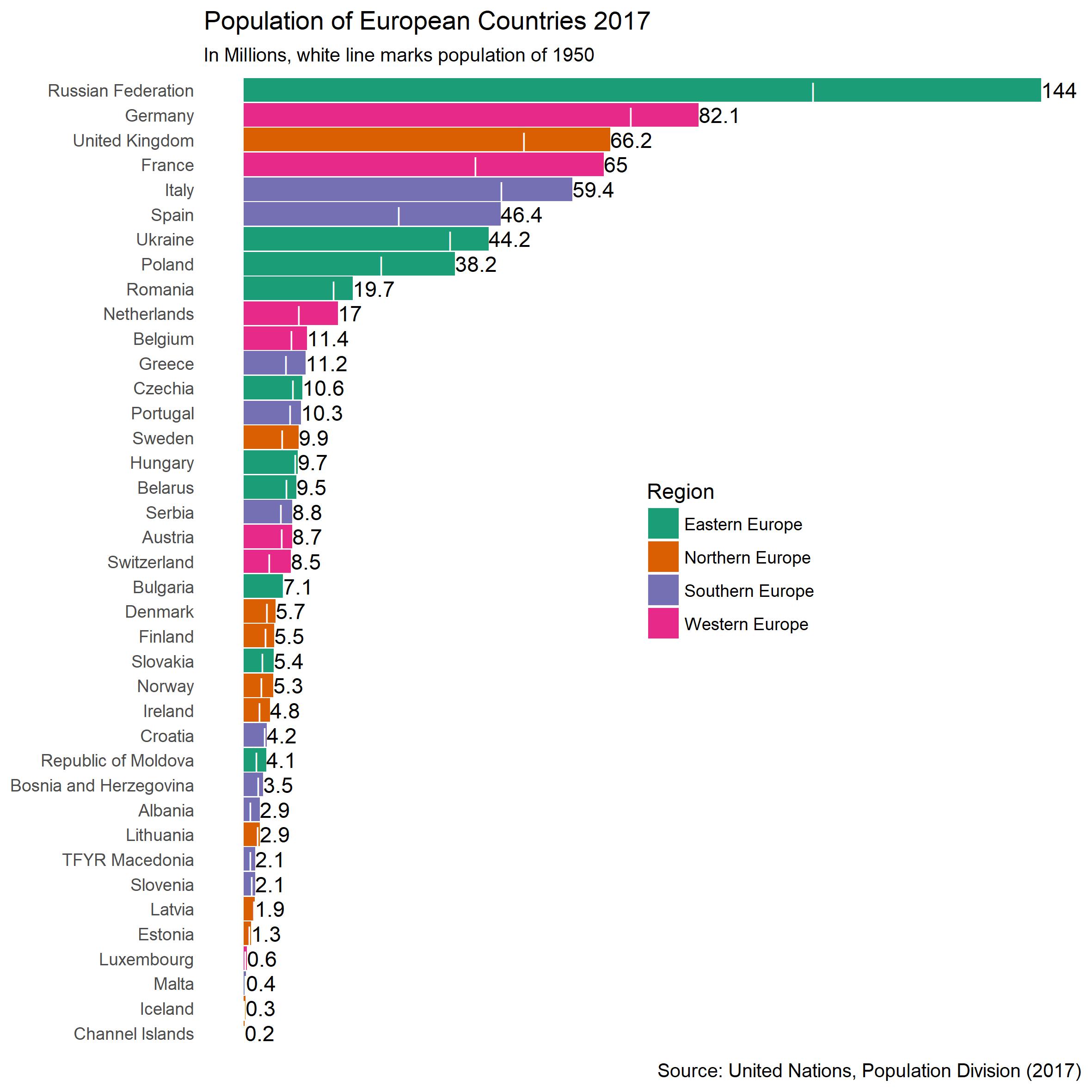
To add some information how much the population of all the countries changed, I added the bar-chart and marked the population of 1950. It probably would have been wise to split the bar-chart into two, because the population-sizes are so different. But after several attempts I couldn’t figure out am easy or smart way of doing it. And because I should study , I leave it for now.
It would be very interesting to do the same with countries from all over the world and compare the results. I’ll add it to my Todo-List.