Categories
Art Fun Generative Art Glitch Art

Beyond Charts: Creating Glitch Aesthetics with R

This newest project doesn’t have much to do with data visualization, but I use R for it. I am into Glitch Art  quite some time already. So far, I  used apps or plugins to create my own. BUT this will change now.

I was interested if I could write anything like this on my own. R is probably far from the  optimal tool to work on images, but it is the only programming language I really know, so it must do. The blog Fronkostin did something with images in R recently and inspired me to try it too.

Here is my first try: I basically, selected a random square of the image and randomly shuffled to color channels around (RGB) or inverted them. And then I repeated the progress between 10 and 80 times. It is quite basic, but I love the look of it. And I just love that I can churn them out automatically, randomly creating an infinite amount of variants.  The whole thing is quite slow and is basically unusable with bigger images, but it is a start.

Code

library(imager)
library(tidyverse)

setwd("path")

#convert image to dataframe. Add additional colorchannels, which will be changed.
img=as.data.frame(image,wide="c")%>%rename(red1=c.1,green1=c.2,blue1=c.3)%>%
mutate(red=red1, blue=blue1, green=green1)

 #this function randomly changes colorchannels of random squares. also uses negative of the colorchannel


colorswitches = function(data,negative=T){

#create cordinates for squares. choose randomly two points on the x and y axis. 
liney=sample(1:max(data$y),2)%>%sort()
linex=sample(1:max(data$x),2)%>%sort()

#there are 6 color variables. three of them are the originals. three of them are the ones who are changed
#variable which defines where color is picked from. chooses from orignal and changable variables. it is important that it also picks from original from time to time. because else at one point all becomes grey.
fromcolor=sample(3:8,1)
#randomly selects one of 3 changable variables
tocolor=sample(6:8,1)

#add 1 to 6 chance the negative of the color is used.
minuscolor=ifelse (sample(1:6,1)==1,T,F)

#this is just that the for counter doesn't has to start at one. small speedup
startbla=max(data$x)*(liney[1]-2)
startbla=ifelse(startbla<1,1,startbla)

for(i in startbla:nrow(data)){

#check if x and y is inside the defined square
if (data$y[i] > liney[1]){
if(data$x[i]<linex[2] & data$x[i]>linex[1]){

#two version of changing the color value of the selected channel. one negative on normal. 
if(minuscolor==T &negative==T) data[i,tocolor]=1-data[i,fromcolor]
else data[i,tocolor]=data[i,fromcolor]
}
}
#if y bigger then selected square, stop loop
if(data$y[i]>liney[2]){
break 
}
}
data
}


#repeating the colorsquare function
for(i in 1:50){
img=colorswitches(img)
}


#create proper RGB code from the three color channels
img=img%>% mutate(rgb=rgb(red,green,blue))

#display it with ggplot.
p<- ggplot(img,aes(x,y))+geom_raster(aes(fill=rgb))+scale_fill_identity()+
scale_y_reverse()+
theme_void()
p

Categories
Map Travel

Where have I been in 2018

Last year I made a post about where I have been in 2017. I was worse with R so I solved it with a combination of cleaning up the data with R, importing it into Qgis and finally edited it in HitFilms.

This time I just did it all in R. The difficult part this time was to get the Google API running for the import of Google maps. (You need to enable billing to get the whole thing running.) It was the first time I used the new ggAnimate. It is great and easy to use. Less of a hazzle then the last times I used it.

I could reuse some of last years code, so I was done quite fast. (not the greatest code tough.)


library(tidyverse)
library(jsonlite)
library(ggplot2)
library(ggmap)
library(gganimate)
library(gifski)
library(zoo)
library(lubridate)

register_google(key = “AIzaSyCTCk3yYCPEo1UKVkZm_iQk_r4wPJCHlA4”)

system.time(x <- fromJSON(“GoogleLoc.json”))

# extracting the locations dataframe
loc = x$locations

# converting time column from posix milliseconds into a readable time scale
loc$time = as.POSIXct(as.numeric(x$locations$timestampMs)/1000, origin = “1970-01-01”)

# converting longitude and latitude from E7 to GPS coordinates
loc$lat = loc$latitudeE7 / 1e7
loc$lon = loc$longitudeE7 / 1e7

# calculate the number of data points per day, month and year
loc$date <- as.Date(loc$time, ‘%Y/%m/%d’)
loc$year <- year(loc$date)
loc$month_year <- as.yearmon(loc$date)

#new dataframe with the important units
maps<- data.frame(loc$lat,loc$long,loc$date,loc$time,loc$year)

#filter out the year and convert the longitude to the proper unit.
maps1<-maps%>%filter(loc.year==2018) %>% mutate(longitude = loc.long/10^7)

#choose the 10. measurement of each day. not very elegant, but good enough.
maps2<- maps1 %>% group_by(loc.date) %>%
summarise(long=(longitude[10]),
lat=(loc.lat[10]))

#get background map. set size, zoom, kind of map)
mamap <- get_map(location=c(mean(maps2$long,na.rm=T),mean(maps2$lat,na.rm=TRUE)+3), maptype = “satellite”,zoom=5)

#put it all together.
ggmap(mamap)+
geom_point(data=maps2,aes(x=long,y=lat),size=4, col=”red”)+
geom_label(data=maps2,x=1.5,y=56,aes(label=format(as.Date(loc.date),format=”%d.%m”)),size=10,col=”black”)+
theme_void()+
#the animation part
transition_time(loc.date)+
shadow_trail(alpha=0.3,colour=”#ff695e”,size=2,max_frames = 6)

a=animate(m, renderer = ffmpeg_renderer(),duration=20)
anim_save(filename = “my2018/2018video.mp4”)

Categories
Germany History Map Switzerland United States

American Cities named after big German, Austrian or Swiss Cities

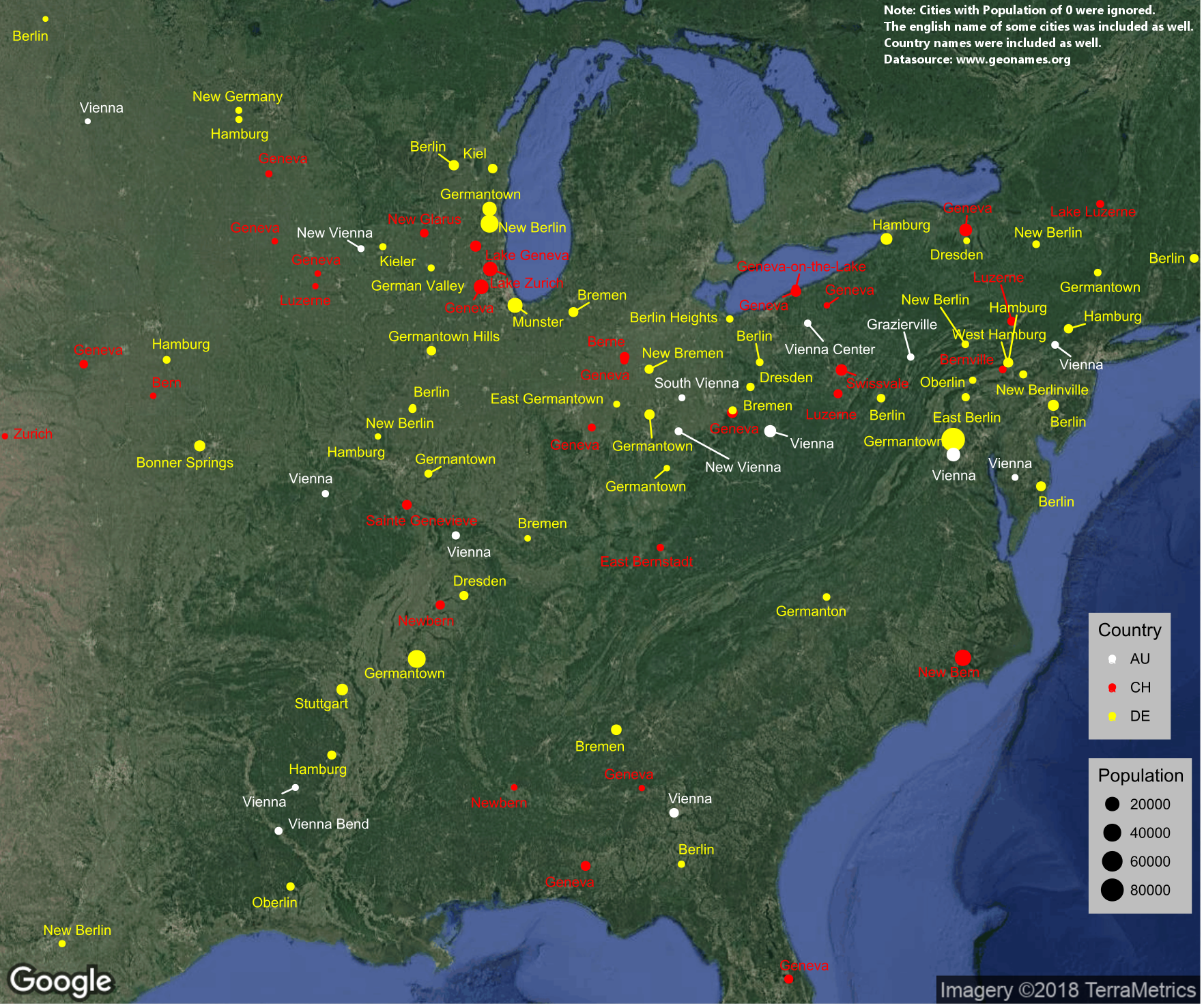
Recently the Swiss ambassador in the United States posted an interesting tweet. It showed a map of places in the US which might have Swiss roots. A little later I found the same map on Reddit too. Reading the discussion and after checking some things myself, I noticed that there were mistakes or the cities weren’t existing anymore. Unfortunately, the ambassador didn’t share any source.

The map made me curious and I thought to check myself. I downloaded a list of places in the United States and Canada from www.geonames.org. I imported it into R and filtered it just for the cities and town.

I then created three lists with search-term for Germany, Switzerland and Austria. For Switzerland I used the names of the Kantons, for Germany the names of the 30 biggest cities and for Austria I took the 10 biggest cities and the name of some of the regions. I also translated some names of more famous places to English. I had to do some filtering because a name like “Uri” just gives a ton of wrong results. I then used the search-terms to look through the cities in the US and Canada.

The first result was, that a big part of cities were dead an had a population of zero. I think it was more than half. I had no clue, that there were so many empty towns in the US. I decided to filter those out, because it cluttered everything. Then I had to filter some more for names like “BERNard” and in the end, I went manually trough the list to remove false positives.

After that I just had to visualize it. I used the packages ggplot, ggrepel and ggmap to create the map. I finished it in Gimp. If anyone is interested in the code let me know.

Categories
Chart Europe History

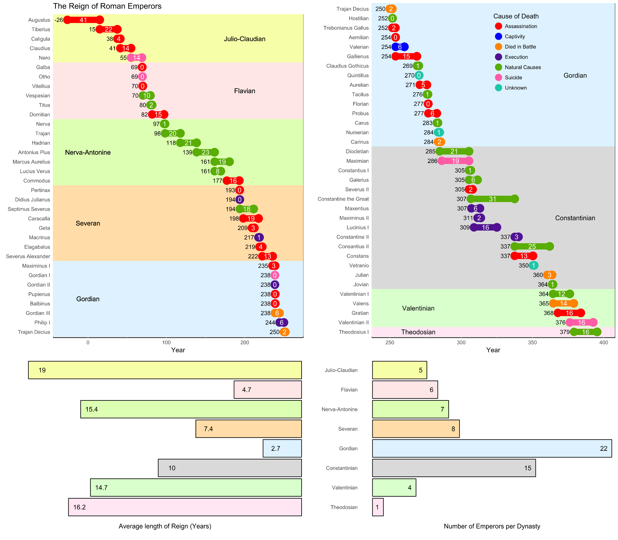
The Reign of Roman Emperors

I visualized the reign and end of Roman emperors. I am quite a fan of history, so when the task in the /r/dataisbeautiful-DataViz-Battle was to visualize the reigns of the Roman Empire, I was excited.

Categories
Chart Europe Population

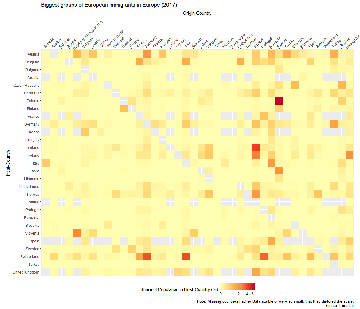
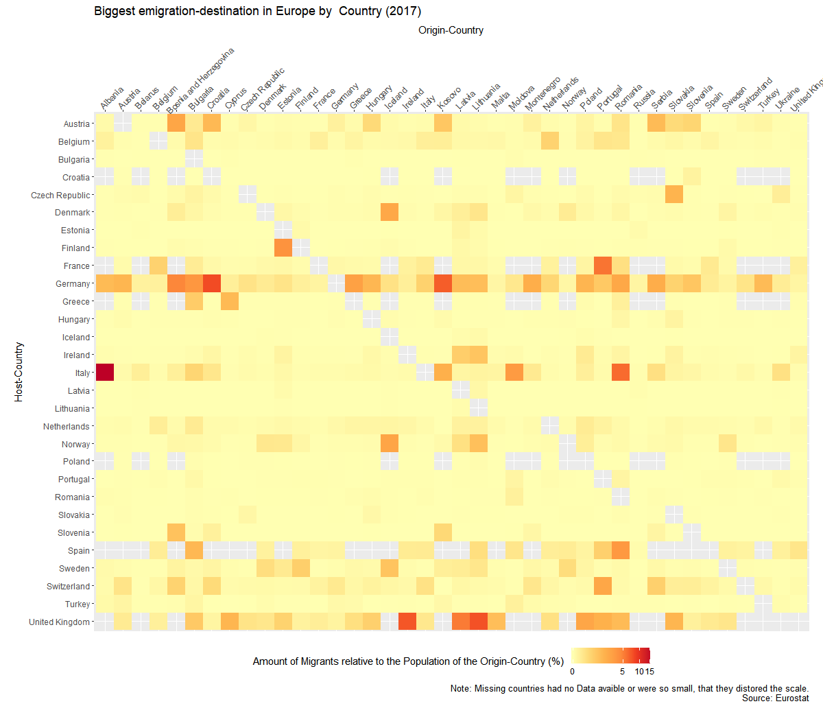
To which European countries do Europeans migrate?


Migration is a huge topic in Europe and I wanted to know where people go, when they leave the country they grew up in. Luckily Eurostat has some Data about that.

There is the problem of huge population differences between the countries, so I wasn’t able to just use the absolut numbers. So I created to graphs. Once it show the migrant-population  relative to the host country and once relative to their origin country.


I created the graphs with the help of R and Ggplot. Code of the second graph:

ggplot(mig1,aes(y=Host,x=Origin,fill=sharehostpop))+
 geom_raster()+
 theme_gray()+
 coord_equal()+
 scale_fill_distiller(palette="YlOrRd", direction = 1,na.value=NA,trans='log1p')+
 theme( 
 axis.text.x=element_text(angle = 45, hjust=.1),
 legend.position = "bottom")+
scale_x_discrete(position="top")+
 scale_y_discrete(limits=names(table(droplevels(mig1$Host)))[length(names(table(droplevels(mig1$Host)))):1])+
 labs(y="Host-Country",x="Origin-Country",fill="Share of Population in Host-Country (%)",
 title="Biggest groups of European immigrants in Europe (2017)",caption="Note: Missing countries had no Data avaible or were so small, that they distored the scale.
 Source: Eurostat")
Categories
Chart Politics Population Switzerland

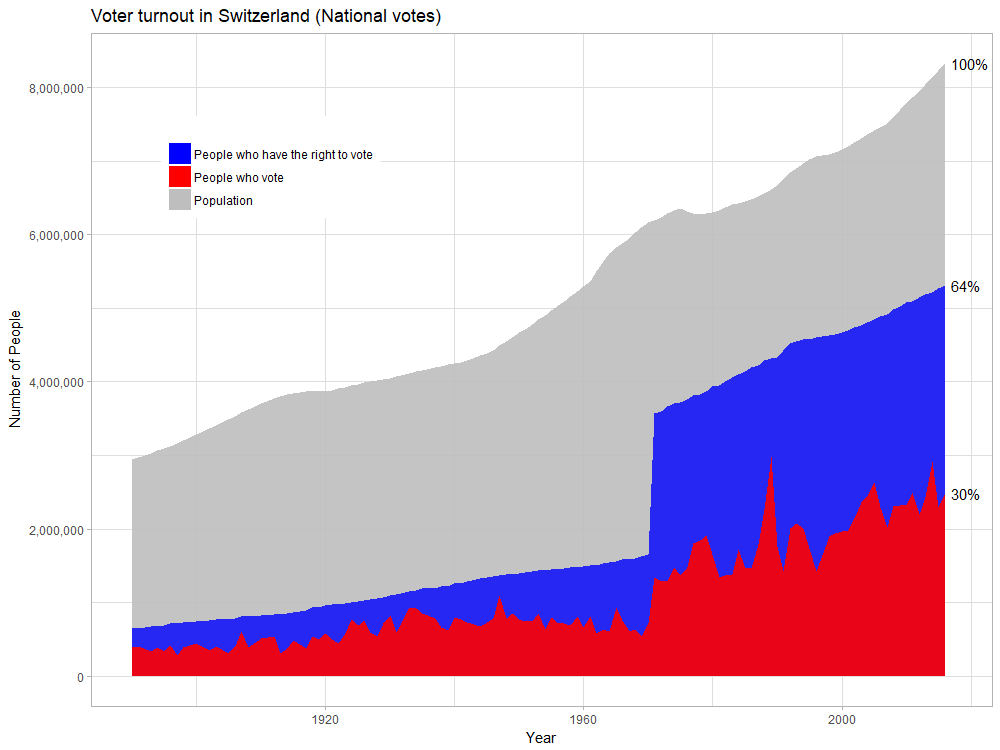
Voter turnout in Switzerland compared to population

Categories
Uncategorized

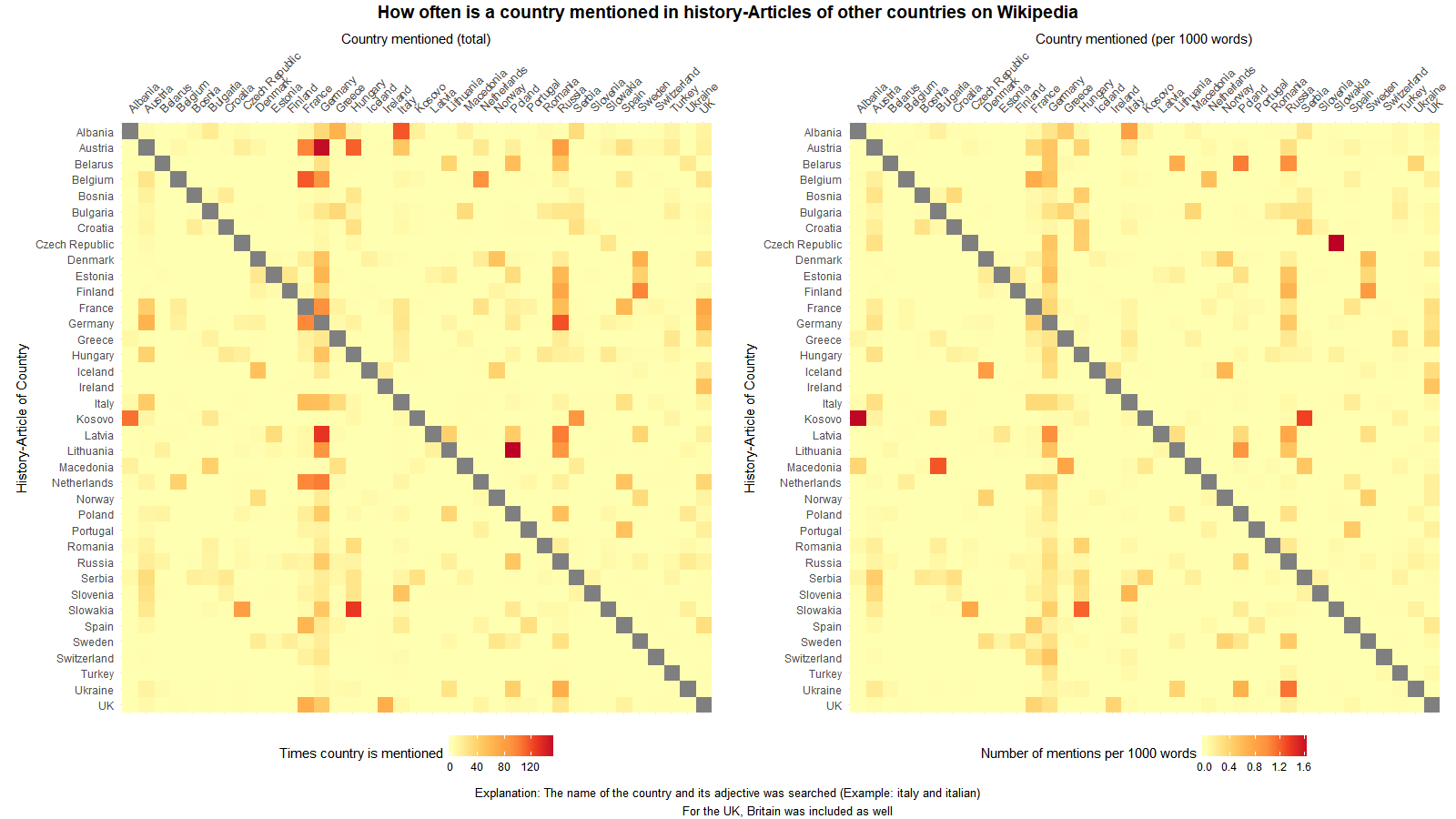
The interaction of European countries during their history

For this graph I counted how many times a country are mentioned in the Wikipedia-article of an other European country’s history.

To do this I did following:

Categories
Uncategorized

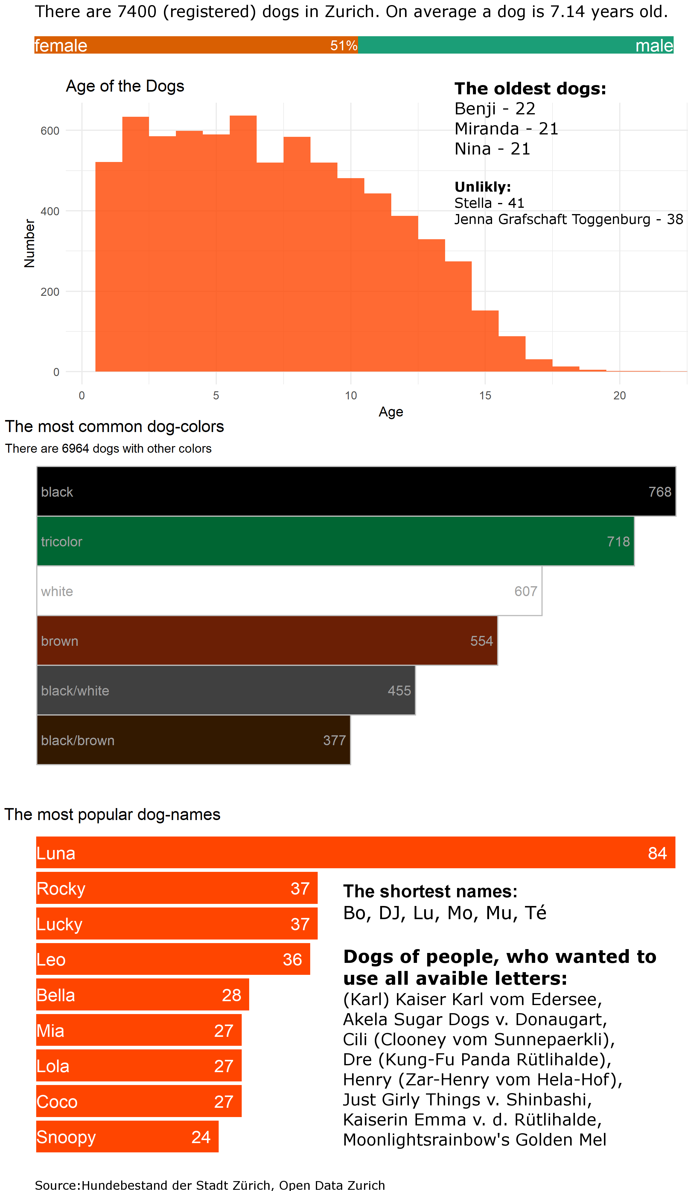
Statistics about the dogs living in Zurich

Categories
Map Politics Switzerland Uncategorized

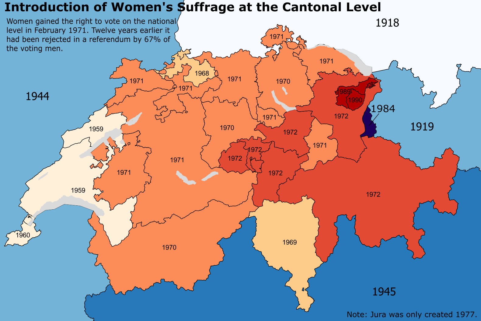
Women’s suffrage in Switzerland at the cantonal level

There are several reasons women in Switzerland gained the right to vote only in 1971. The main reason is the direct democracy. There had to be a referendum to give women the right to vote. It’s quite likely that many countries would have introduced the women suffrage later.

Categories
Fun HowTo

Visualizing a Whatsapp-Conversation

In the last post I showed how I imported a Whatsapp-conversation and tidied it up a bit. Now I want to analyze it. For that I will use the libraries dplyr, stringr and ggplot2.

As a first step, I format the dates properly and create some new columns. I also decide to just focus on two years, 2016 and 2017.

data=data%>%mutate(
  #convert DAte to the date format.
        Date=as.Date(Date, "%d.%m.%y"),
        year = format(Date,format="%y"),
        hour =  as.integer(substring(Time,1,2))
        #I filtered for two year, 2016/17
        )%>%filter(year=='17'|year=='16')

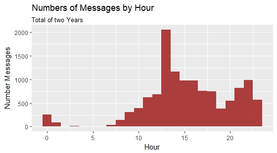
ggplot(data,aes(x=hour))+
  geom_histogram(fill="brown",binwidth=1,alpha=0.9)+
  labs(title="Numbers of Messages by Hour", subtitle="Total of two Years",
       y="Number Messages", x="Hour")

See more about the writing behavior of me an my friend, there is more formatting necessary. The words need to be counted too. To do so I use the stringr-library with str_count(data$Message, "\\S+")